Here we would like to introduce the example of logo design for yakiniku and grill restaurants.
Request details for Yakiniku Logo Design“秀 SHU”
- Design shall use calligraphic kanji and alphabets
- Design shall be readable for foreigners
- Design shall give off Japanese feeling
- Design shall have simple, neutral taste

Japanese Kanji Design
We created unique calligraphic characters by combining thick lines and thin lines.
We selected a neutral design that will be accepted by both men and women.
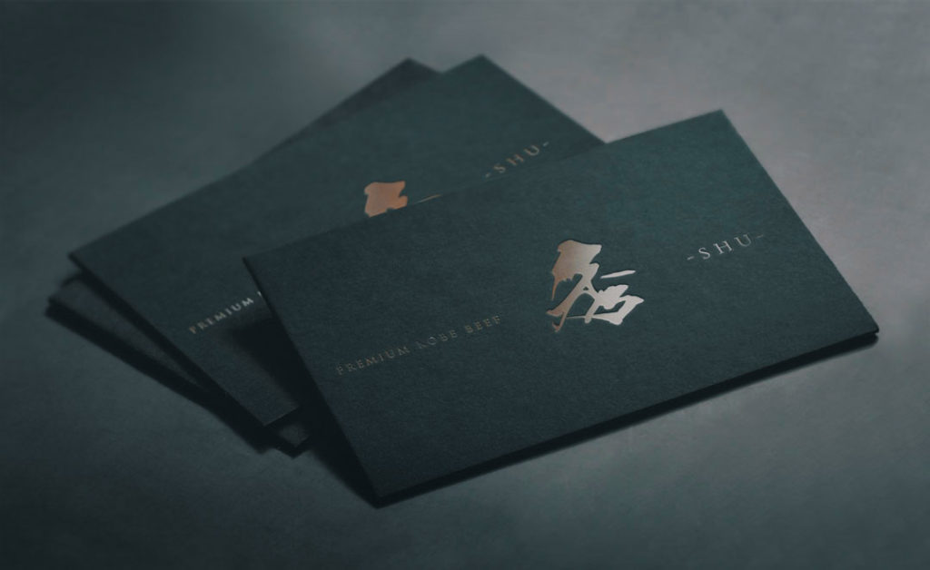
Logo Design
We adjusted the arrangement and size of characters in a way that emphasizes the calligraphic kanji “秀”.
We made it simple without using any flashy decorations.
By adding the phrase “PREMIUM KOBE BEEF”, we enhanced its design and made it readable for foreigners.
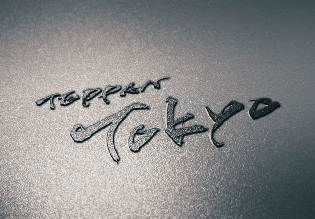
Request details for Japanese logo design“TEPPAN TOKYO”
- Design shall use calligraphic characters for all alphabets
- Design shall have a good legibility while offering a unique design
- Design shall give off Japanese feeling
- Design shall give off Japanese feeling

Japanese Kanji Design
We designed all alphabets using calligraphic characters. Our alphabet design offers both Japanese taste and uniqueness.
It’s an aggressive design but we didn’t compromise its legibility.
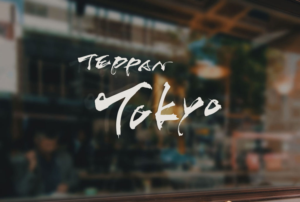
Logo Design
We allocated “TEPPEN” in small font at the upper-right to keep balance with the main wording “TOKYO”.
We didn’t use any decorations except for the characters to create a simple design that will not make people get tired of.
