Here are some of the sushi restaurant logo designs we have created in the past.
We hope this will be of some help to those who are planning to create a logo design for a sushi restaurant, or who are considering using brush strokes in their logo design.
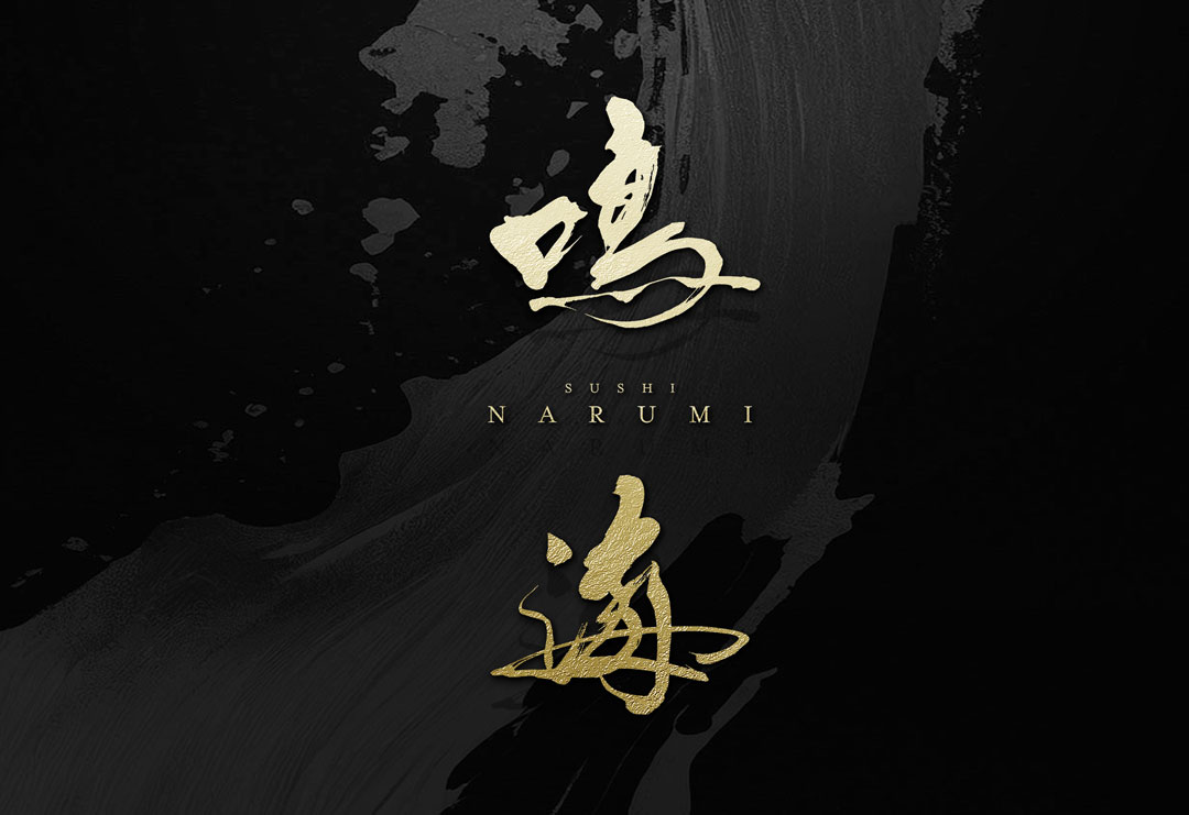
Sushi Logo Design Idea│『NARUMI』
The logo pairs the calligraphic “Narumi” with its English notation “NARUMI”, influencing each other in their arrangement.
The calligraphy part expresses the strength and natural flow of traditional calligraphy, while the English part showcases modern simplicity and the choice of a refined font.
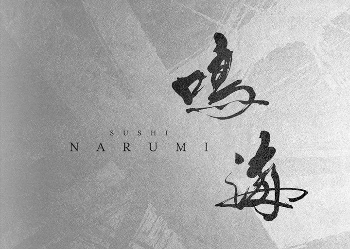
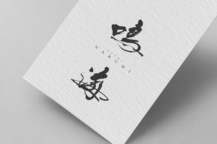
Authentic Sushi Restaurant Logo Design – Narumi
Sushi Logo Design Idea│『NISHIKI』
The logo for “Sushi-Place Nishiki” is designed to express the artistry of sushi.
It aims to coexist classical beauty with a modern sense of cleanliness, evoking the ‘spirit of harmony’ inherent in the food culture of sushi.
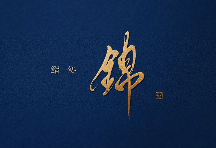
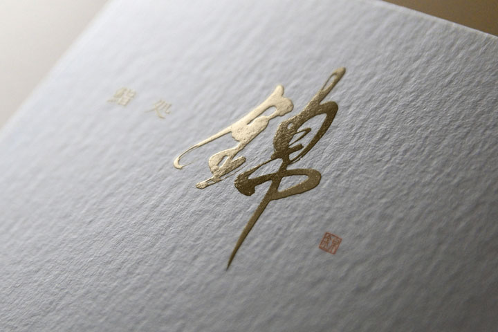
Traditional Sushi Restaurant Logo Design – Nishiki
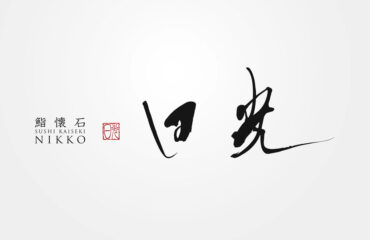
Sushi Logo Design Idea│『NIKKO』
A well-balanced combination of fine lines and thick lines with a hint of puddling gives the logo a tasteful brush stroke.
The font and seal impressions were kept modest to create a logo design for a sushi restaurant where the brush strokes stand out with a sense of luxury.
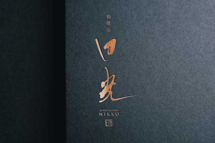
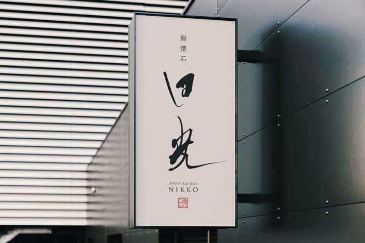
Logo Design For Sushi Kaiseki Nikko
Sushi Logo Design Idea│『YUZEN』
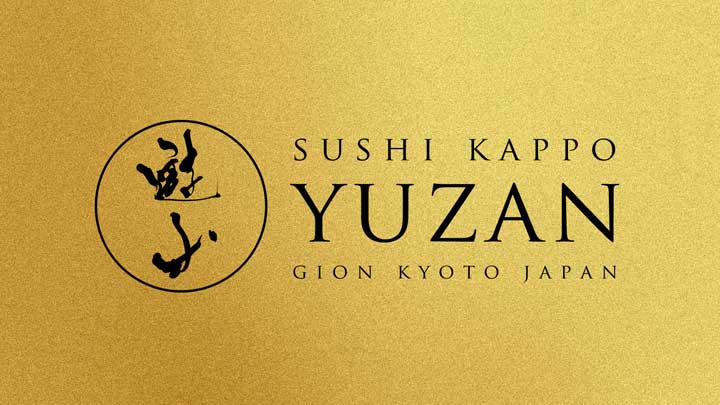
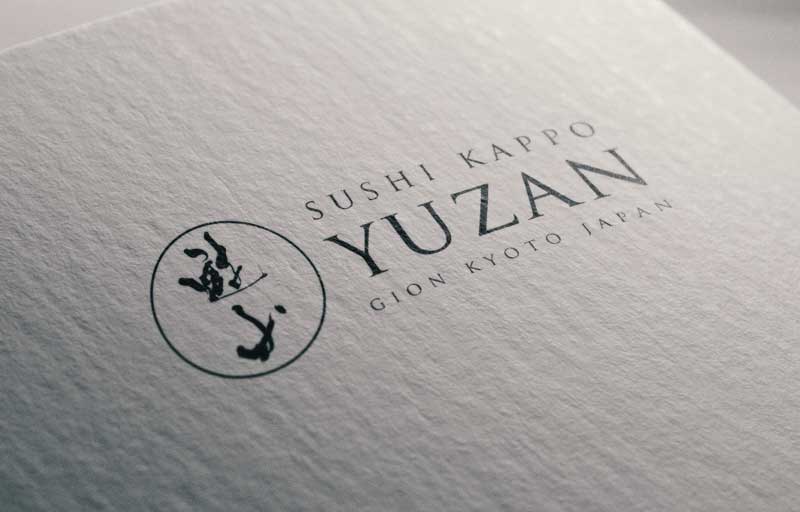
I used a brush with a slightly soft ink to create a sense of tradition.
The “Yuzan” surrounded by arcs was designed to be used by itself without the font.
The font was laid out so that it fits into a square, and the entire logo design is a combination of circles and squares.
Sushi Logo Design│『CHITOSE』
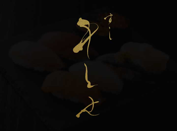
This is a simple logo design with only brush strokes.
This logo design has an elegant softness that brings out the best of the brush stroke, such as the pooling of the ink and the undulation of the lines.
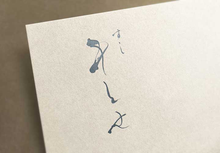
Sushi Logo Design│『IZUMI』
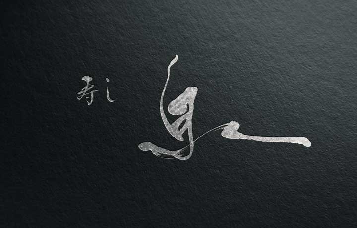
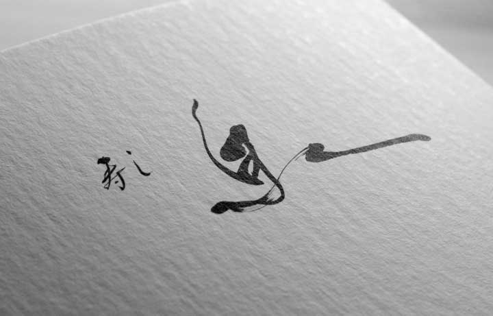
This logo is designed to give a sense of speed and dynamism, while minimizing blurring and extreme splashes.
The “Sushi 寿し” logo was also created with brush strokes and placed in a well-balanced manner.
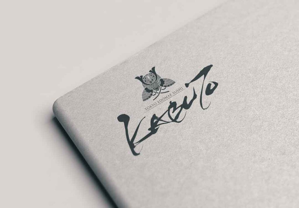
Sushi Logo Design│『KABUTO』
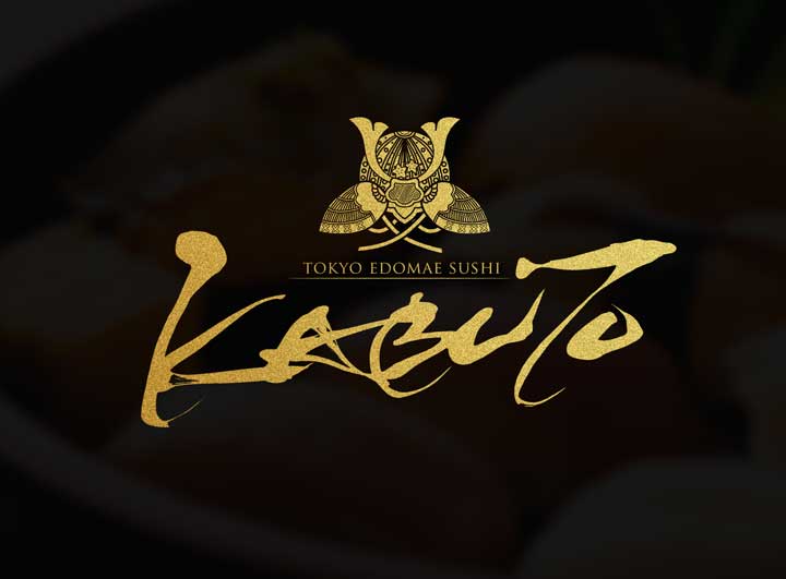
The brush strokes are boldly designed without compromising readability.
The beauty of the brushstroke is that it can express harmony even though it is an alphabet.
This unique logo is a well-balanced combination of a family crest and alphabetic handwriting.
Sushi Logo Design│『MUSASHINO』
We created brush strokes with an elegant and soft impression to match Sushi Kaiseki.
Each letter has a different size to enhance the design and readability.
The font of “Sushi Kaiseki 鮨懐石” is laid out in a subdued manner to make the brush strokes stand out.
The logo is designed to give a simple and elegant impression.
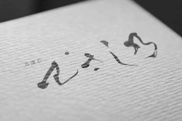
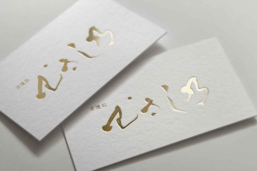
The Art of Logo Design: Unveiling ‘Sushi Kaiseki Musashino
Summary
These are some of the sushi restaurant logo designs we have created in the past.
We hope this will be of some help to you in your future logo design projects.
In addition to this article, we have more examples of our work, so please take a look.
Recommended Related Articles
About Us
SANTEN Design is a company specializing in the production of brush lettering logos.
We specialize in the creation of flexible brush lettering logos to suit a variety of uses and requests.
We will be happy to provide you with quotations, consultations on various types of production,
and of course, detailed information on our achievements.
Please feel free to contact us for a quotation.

