How is ‘Ramen’ Written in Kanji?
If you’ve experienced Japanese culture, many of you will be familiar with ramen.
This delicious noodle dish is loved not only within Japan but also around the world.
But how is this “ramen” written in kanji in the Japanese language?
In fact, in most Japanese menus and signs, “ramen” is written in katakana as 「ラーメン」.
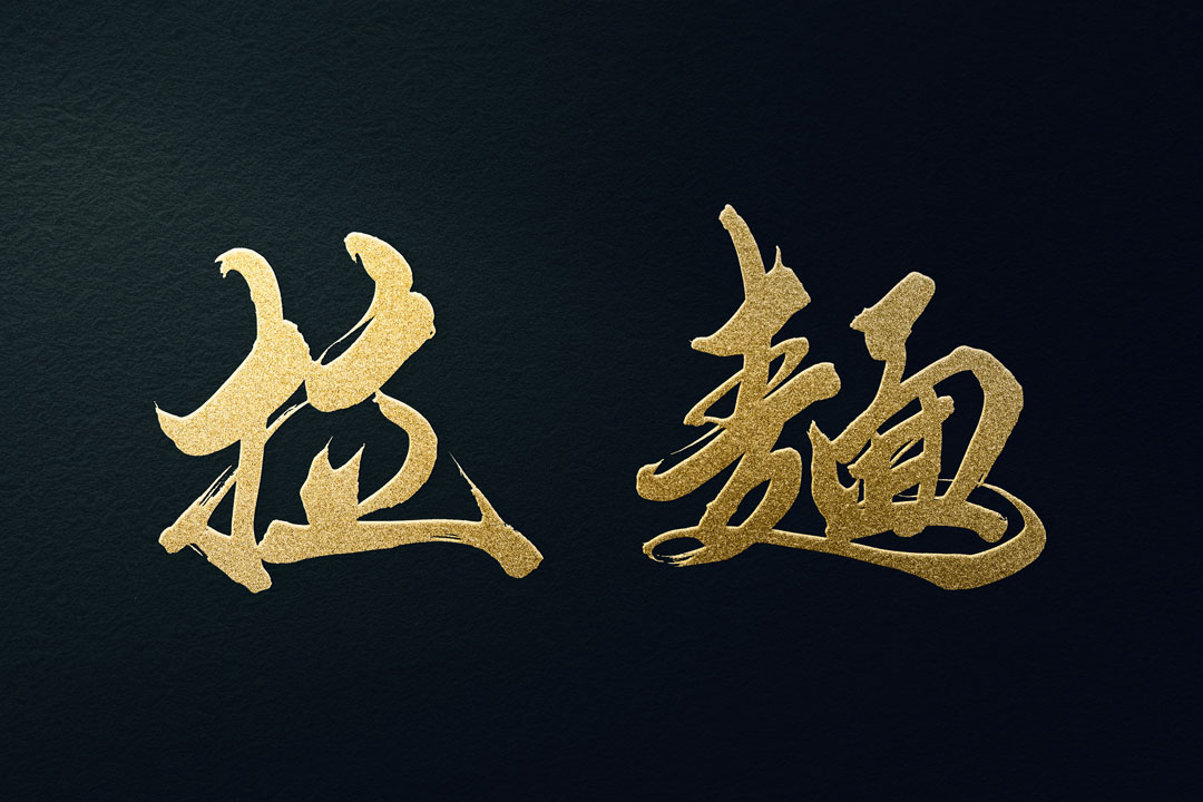
However, in kanji, it can also be written as 「拉麺」.
“拉” means “to pull,” and “麺” represents “noodles.” Thus, 「拉麺」 literally translates to “pulled noodles.”

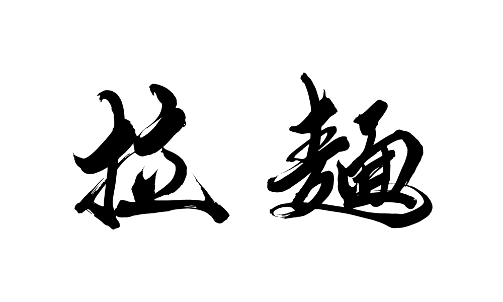
Ramen Logo Design Examples
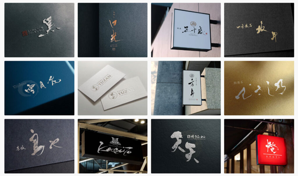
Here are some of the logo designs we have created for ramen restaurants.
- Mendou Ibuki 麺道 伊吹
The logo design of “麺道 伊吹” (Mendou Ibuki) brilliantly combines traditional Japanese aesthetics with a modern touch.
A distinctive feature of the design is its use of Kanji characters.
At the heart of the logo, “麺道” (Mendou) is depicted with a flowing calligraphy style, evoking the smoothness of noodles and the fluid technique of ramen making.
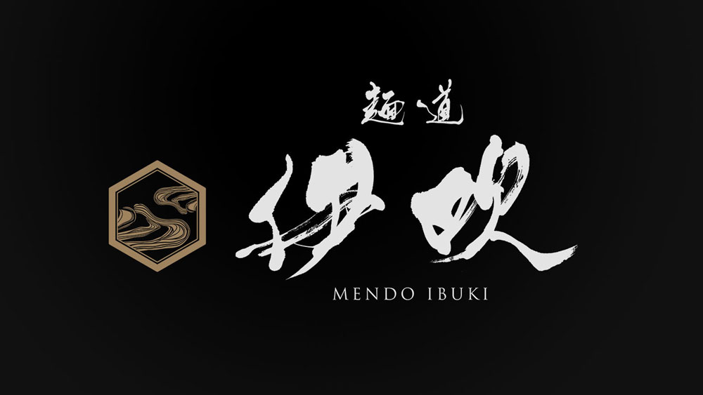
Additionally, the Kanji “伊吹” (Ibuki) is rendered with a firm brushstroke, emanating the majestic presence akin to that of Mount Ibuki.
- Niboshi Tsukemen Fugenntei 煮干しつけ麺 風元亭
The logo design of “煮干しつけ麺 風元亭” (Niboshi Tsukemen Kazemototei) beautifully captures a balance of delicacy and tradition.
A distinguishing aspect of this logo is the combination of Kanji and Hiragana characters, symbolizing a fusion of traditional Japanese beauty with a modern approach.
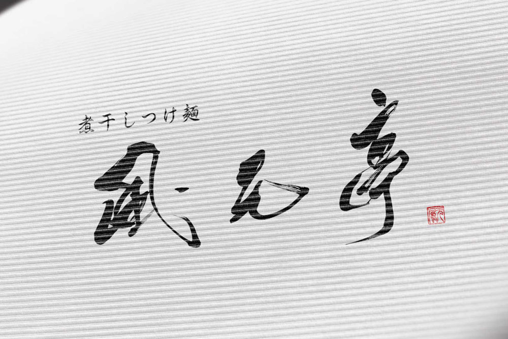
The Kanji “風元亭” (Kazemototei) is designed with a typeface that reminisces of elegant traditional Japanese inns and restaurants.
This part imparts a sense of reassurance and luxury to potential patrons.
- Ganso Otaya 元祖 太田屋
The logo design for “元祖 太田屋” (Ganso Ohtaya) stands as a symbol of long-standing tradition and quality.
Centered around Kanji characters, the design evokes a deep sense of history and reverence for Japanese traditional culture.
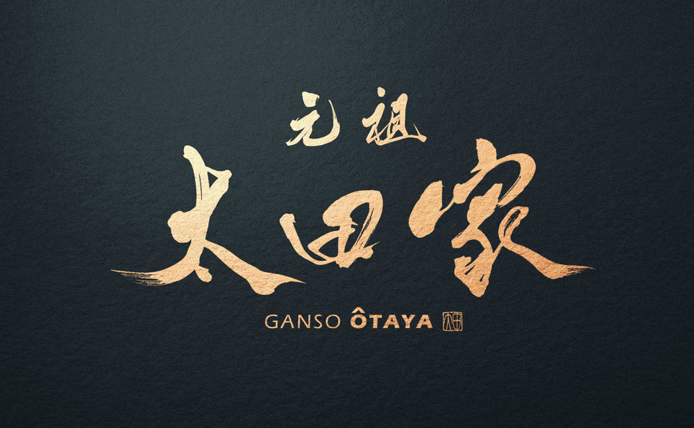
The characters “元祖” (Ganso), meaning “originator” or “founder”, highlight the establishment’s history and its pride as a pioneer in the region.
The choice and placement of this term emphasize the unique value and superior quality that sets it apart from others.
The “太田屋” (Ohtaya) segment is penned with a stable brushstroke, crafting a logo that exudes reliability and trust.
The warmth inherent in this name, suggestive of familial ties and community connections, plays a central role in the overall logo design.
Other Ramen Logo Designs Introduction
Summary of Ramen in Kanji
There may have been people who were not sure how to read “Ramen 拉麺” or who knew it but did not know the meaning of the kanji.
We hope that we can be of some help to you along with the reading and meaning of the word.
About Us
SANTEN Design is a company specializing in the production of brush lettering logos.
We specialize in the creation of flexible brush lettering logos to suit a variety of uses and requests.
We will be happy to provide you with quotations, consultations on various types of production,
and of course, detailed information on our achievements.
Please feel free to contact us for a quotation.
