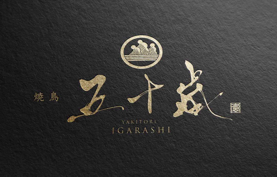
The logo of ‘Yakitori Igarashi‘, breathing with traditional brush touches, is a work that fuses the classical beauty of Japan with modern, sophisticated sensibilities.
This logo, while simple, expresses the deep taste and history of yakitori as a symbol of Japanese food culture.
Today, I would like to discuss how this delicate piece was created from the perspective of its creator, and the thoughts and emotions imbued within it.
Concept
This logo skillfully expresses the fusion of Japanese tradition and modernity.
The brushstroke calligraphy embodies the techniques and spirituality of traditional calligraphy, while its arrangement and composition convey a contemporary sense.
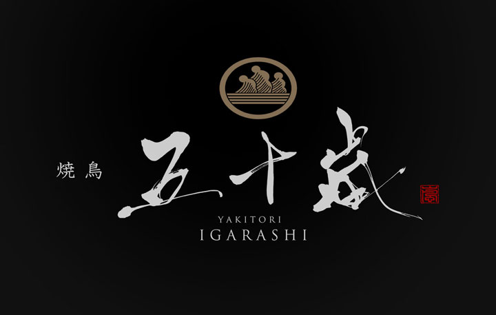
The flow of the brushstroke calligraphy suggests the flickering of the charcoal used in grilling yakitori, showing respect for the food culture.
About the Calligraphy
The store name “Igarashi” is written with a brushstroke strength that is not overly strong, with each character seeming to mimic the movements of a craftsman handling ingredients.
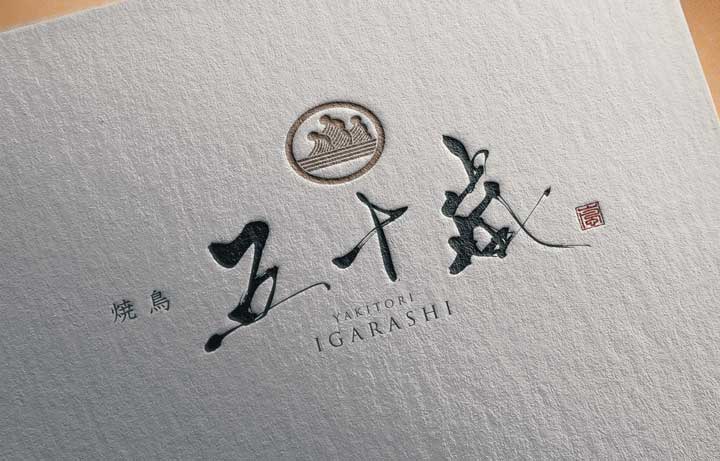
The shapes of the characters evoke the precision of skewering yakitori and the meticulous act of grilling it over a fire.
This logo communicates a passion for food and a fine balance in cooking that is not too elaborate.
Logo Design Details
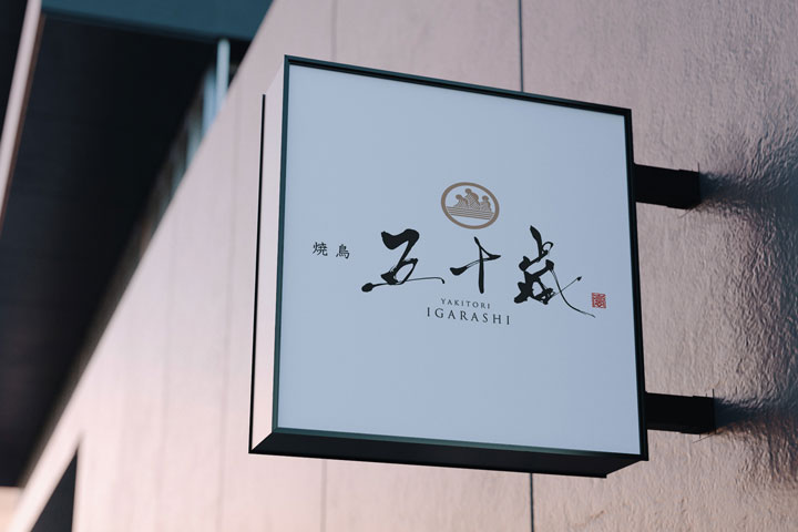
The combination of a gold logo and a red seal expresses visually the blend of history and modernity, tradition and innovation, that the “Yakitori Igarashi” brand embodies.
It merges the values that the store cherishes with its historical background, telling a unique brand story.
Conclusion
In our recent logo design project for “Yakitori Igarashi”, we focused on visually expressing the store’s identity, incorporating brush calligraphy, a family crest-like design, and traditional seal engraving.
We hope that this logo will contribute to long-term brand recognition and enhance customer loyalty.

