It is my pleasure to share with you the logo design created for the Tsukemen restaurant “Jin,” unraveling the story behind its creation from the perspective of its conception.
Concept
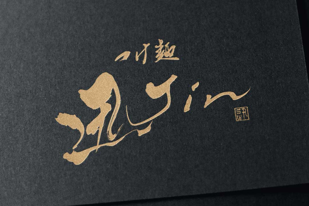
The logo design for “Jin” symbolizes the world of tsukemen noodles by embodying both “the swiftness of a moment” and “the pursuit of long-lasting flavor.”
While inheriting the traditional beauty of calligraphy, the design has been refined to suit modern sensibilities.
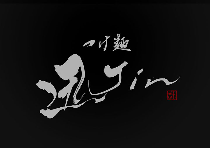
About the Calligraphy
The calligraphy respects the traditional aesthetics of calligraphy while reflecting the stance of “Jin,” which is open to the challenge of creating new flavors.
The strength and elegance infused in each character appeal to the senses of the diner.
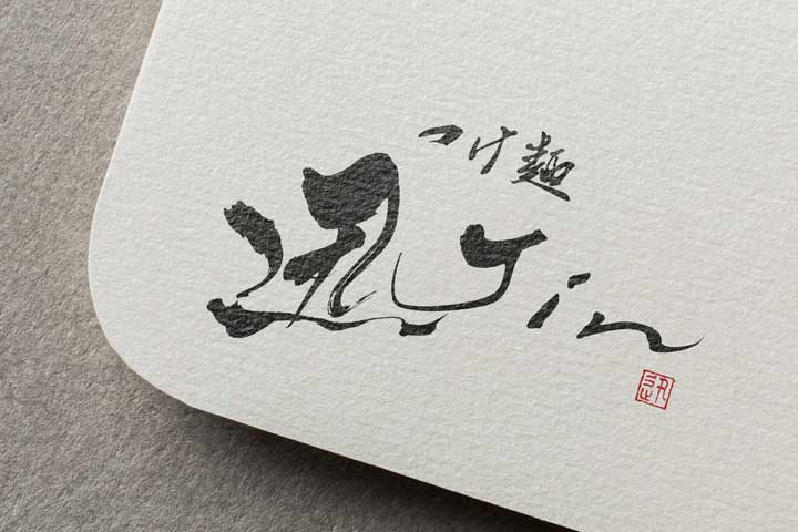
Logo Design Details
The calligraphic character “Jin” serves as both part of the restaurant name and a dynamic element that catches the eye.
The overall design is modern yet conveys a sense of warmth.
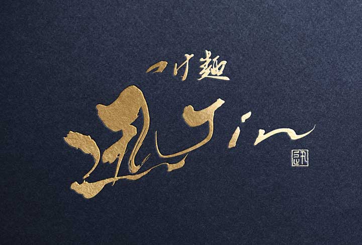
Conclusion
The logo creation this time merges the classic beauty of calligraphy with a modern dynamic feel, forming the identity of a restaurant.
It is our hope that this logo contributes to creating memorable moments for people through the experience of food.

