Today, we’d like to talk about the logo we designed for “Yakitori Kura”.
We’ll introduce our approach to creating a design that’s simple yet meaningful.
Concept
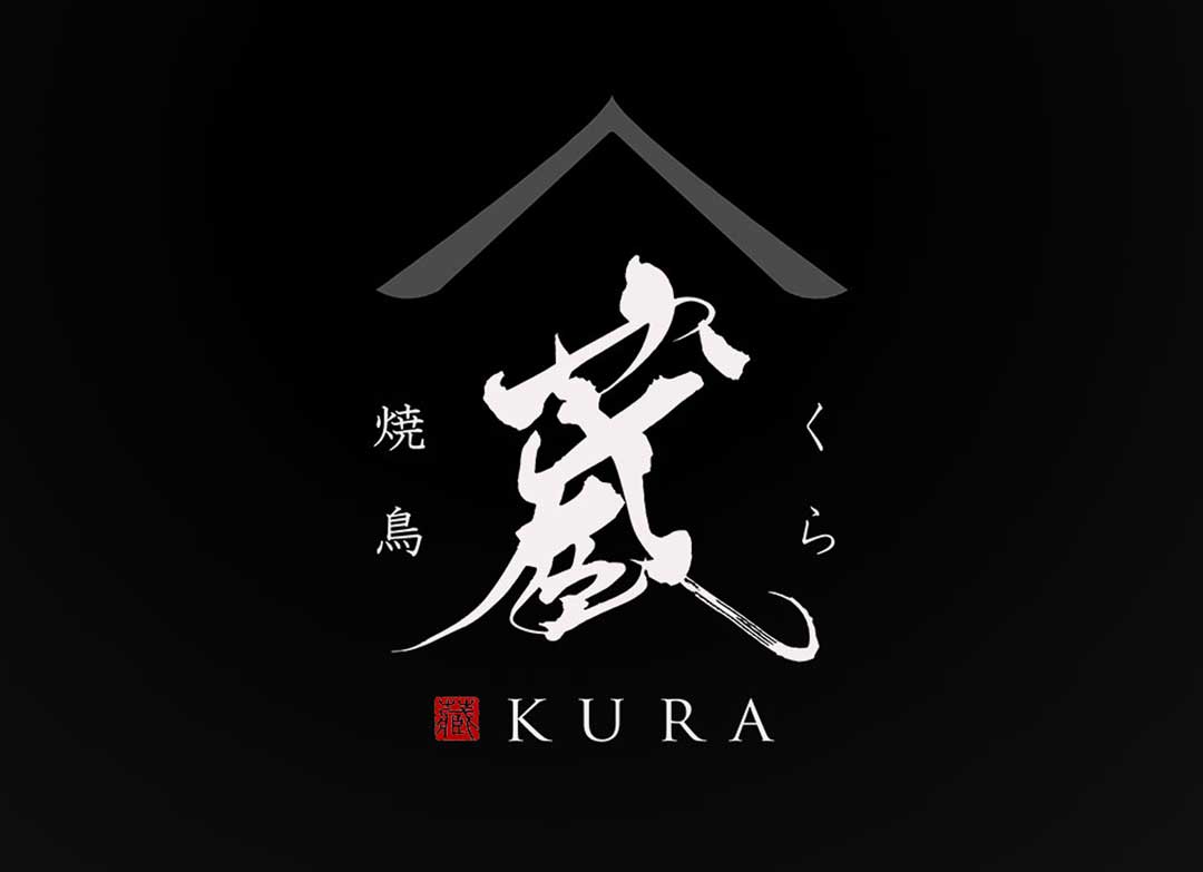
The concept behind the “Yakitori Kura” logo is to preserve the good old Japanese atmosphere while infusing a contemporary air.
We aimed for a design that combines the warmth of an old folk house with the sophistication of modern architecture.
About the Calligraphy
The brushed character “Kura” we chose respects the spirit of traditional calligraphy while expressing it with a novel touch.
By breathing life into each character, we highlight the originality of the restaurant.
Logo Design Details
This logo, while modern, evokes the beauty of traditional Japan.
The silhouette shaped like a roof at the top symbolizes a home that warmly welcomes visitors.
The English inscription is with an international perspective in mind.
Conclusion
The “Yakitori Kura” logo, born from careful brushwork, will provide comfort to those who see it.
We sincerely hope that this logo, as the new face of the yakitori restaurant, will be loved by many.

