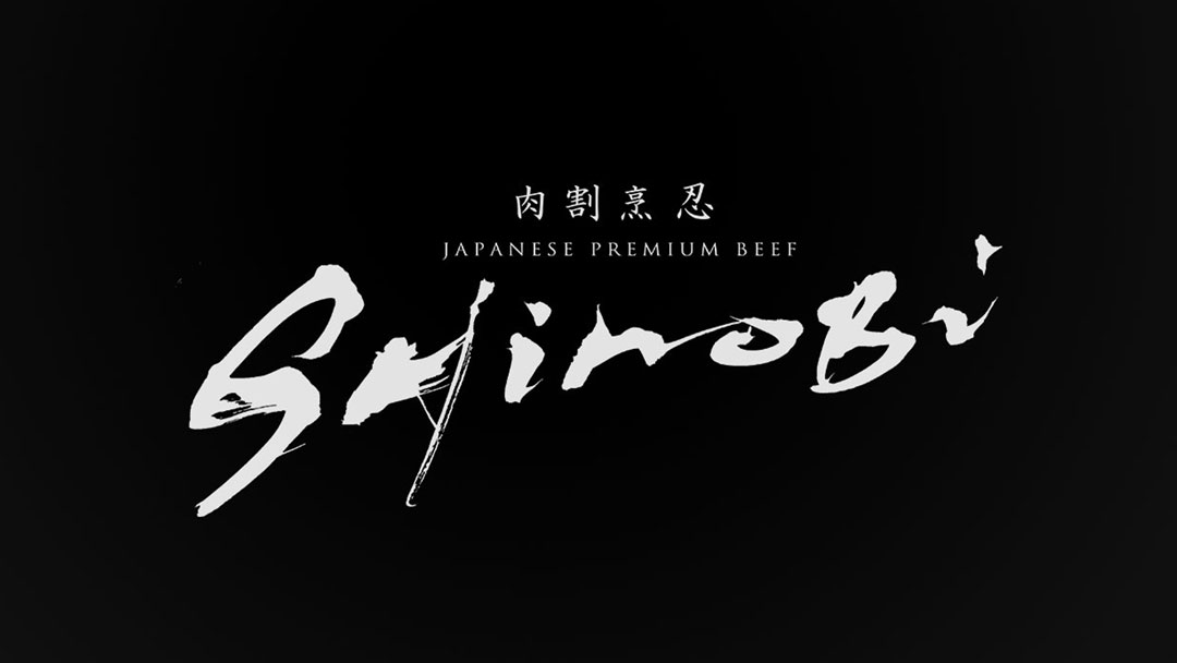
The logo of “Niku Kappou Shinobi” was created with the aim of being simple yet memorable.
In this article, I will discuss how this logo came to be and what message it intends to convey.
Concept
“Niku Kappou Shinobi” is a serene hideaway that serves premium quality meat dishes.
The logo symbolizes the quietude and the excellence of our cuisine.
It represents a place where the robustness of the meat dishes and the tranquility of the dining experience coexist.
About the Calligraphy
The brush writing was chosen to convey the spirit of Japanese cuisine to the modern era.
The written characters reflect tradition while also embracing a contemporary feel.
This balance plays a crucial role in embodying the worldview of “Niku Kappou Shinobi”.
Logo Design Details
The logo embodies both simplicity and strength.
This balance captures the essence of the word ‘Shinobi’, which implies a quiet yet powerful influence.
Additionally, the inclusion of ‘JAPANESE PREMIUM BEEF’ in the logo succinctly communicates the quality of our cuisine.
Conclusion
The logo of “Niku Kappou Shinobi” symbolizes both our respect for culinary culture and the high quality of the dishes we offer.
We hope that this logo will become more than just a symbol; it will be a memorable emblem that resonates with the deep flavors of our cuisine for all our guests.

