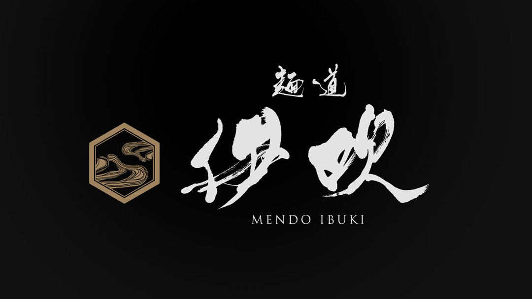
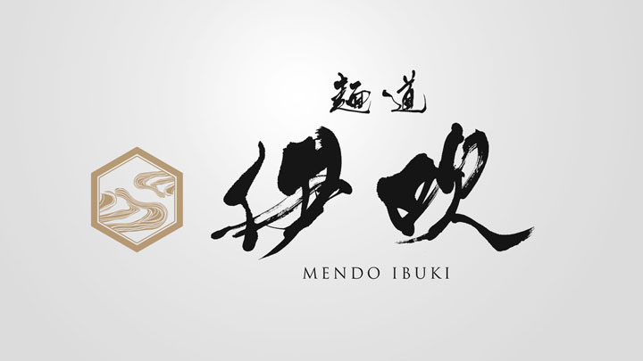
This time, I had the opportunity to design a new logo for a ramen restaurant called “Men-dou Ibuki”.
I focused on creating a design that is simple and easy to understand, effectively reflecting the atmosphere and dedication of the restaurant.
In this article, I will discuss the design process and the concept behind it.
Concept
The concept of the “Men-dou Ibuki” logo design was to express it in an intuitive and easy-to-understand design, centered around brush calligraphy.
The logo was created to reflect the Japanese ambience of the restaurant and the passion for the ramen provided to the customers.
About the Calligraphy
The brush calligraphy “Ibuki” is a central element of the logo.
While based on traditional calligraphy, the strong and dynamic flow of the brush strokes is reminiscent of the dynamic movement in ramen making.
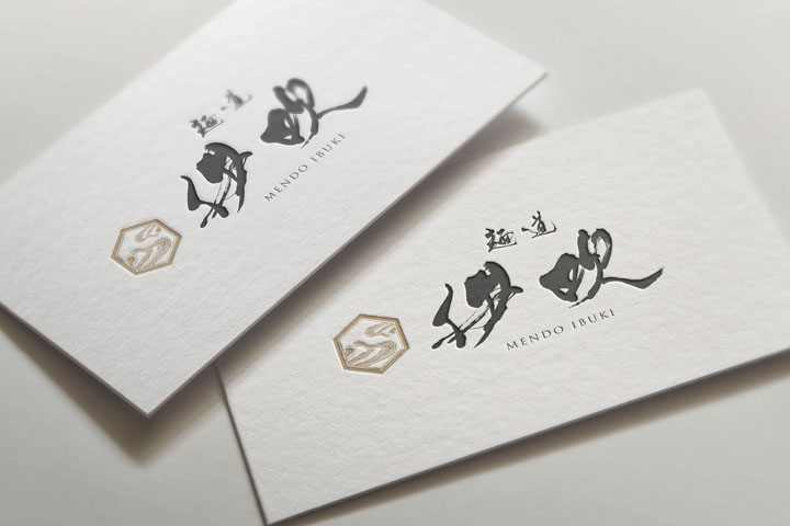
Logo Design Details
The crest-like figure placed in the upper left of the logo combines the swirling noodles of ramen with naturally curved lines that evoke a sense of the wind.
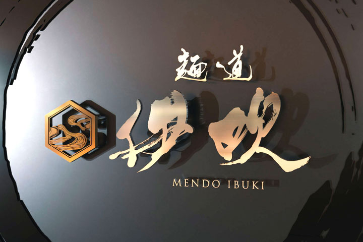
These curves not only remind us of the name “Ibuki,” which means wind, but also symbolize the various elements of ramen, such as the smooth flow of the noodles and the deep flavor of the soup, aiming to leave a quiet yet strong impression on the viewer.
Conclusion
I hope the logo design created this time will deeply engrave the unique character of the restaurant in the hearts of the visiting customers.
I look forward to continuing to convey the charm of the restaurant through my design work with an unwavering attitude.

