Today, we would like to briefly introduce the thoughts and design features embedded in the logo of the charcoal-grilled Yakiniku restaurant “Sumibi Yakiniku Ren”.
Concept
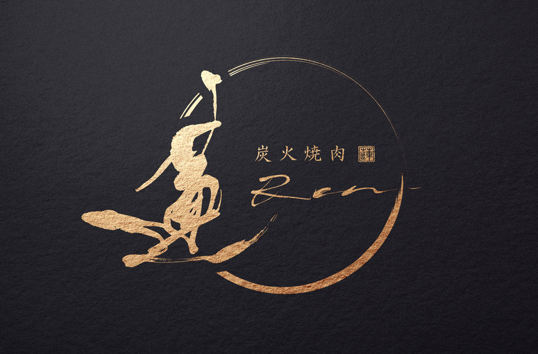
The logo design, centered on the character ‘Ren’ which means lotus, aims to blend the robustness of charcoal-grilled meat with an air of sophistication that exudes luxury.
In doing so, we have honored traditional Japanese calligraphy while choosing a stylish shape that fits the modern sensibility.
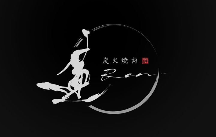
About the Calligraphy
The brush script was created using traditional Japanese calligraphy techniques.
The flow of the brush, embodying both softness and strength, symbolizes the delicate yet dynamic flavor of charcoal-grilled meat.
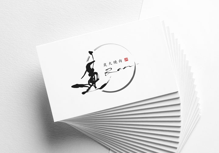
Logo Design Details
The overall design is based on black, conveying a sense of luxury and serenity.
The eye-catching red seal stamp symbolizes confidence in outstanding quality and service, creating an accent that is memorable.
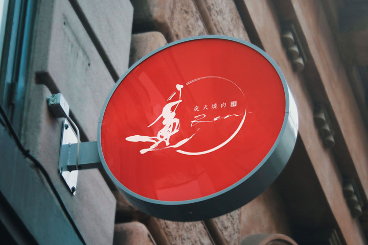
Conclusion
The logo of “Sumibi Yakiniku Ren” is an essential part of conveying to customers that this is not just any Yakiniku restaurant, but a place that offers a special experience, through the charm of traditional brush script and the fusion with modern design.
We hope that this logo will be loved by many and grow into a brand that remains memorable.

