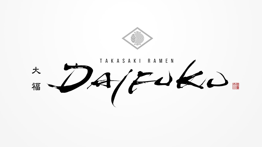
Alphabet and Japanese brush script weave together the logo design of the ramen restaurant “DAIFUKU”.
We introduce to you a design that is modern yet evokes a sense of tradition.
Concept
The “DAIFUKU” logo was designed as a bridge between modernity and tradition.
Utilizing the silhouette of the alphabet while applying traditional brush script techniques, the aim was to create an accessible design that exudes a sense of luxury.
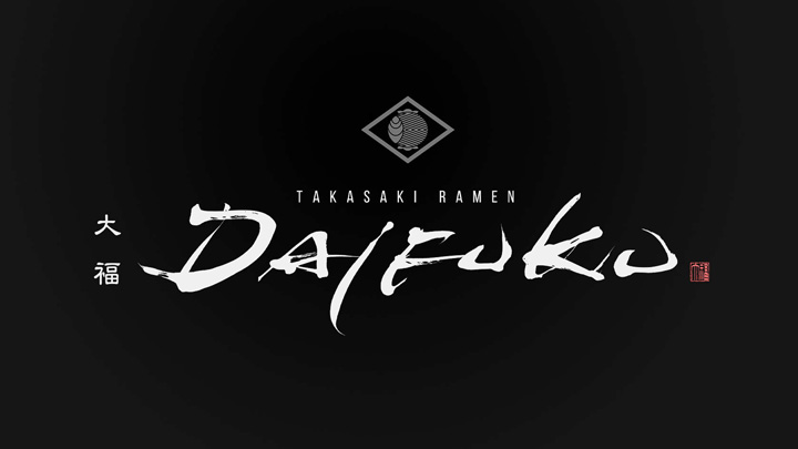
About the Calligraphy
The dynamic expression of brush script creates works that are passionate and highly spiritual.
In the “DAIFUKU” logo, this classic method of expression has been reinterpreted in a contemporary way, infusing the Western letters of the alphabet with an Oriental flavor.
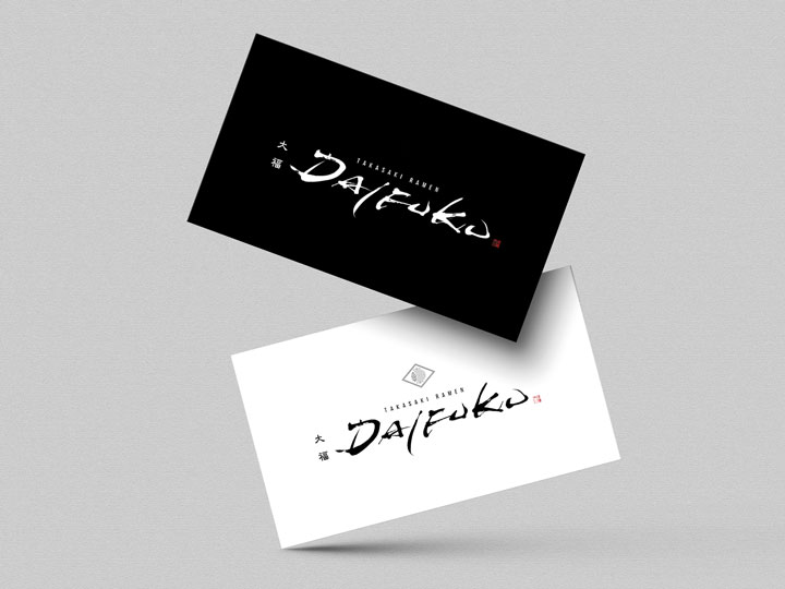
Logo Design Details
The emblematic shape at the center, reminiscent of a family crest, represents both dignity and tradition, while the red color of the seal acts as a visual point that is easy to remember.
Throughout, the subdued color scheme and refined composition highlight the restaurant’s sense of luxury.
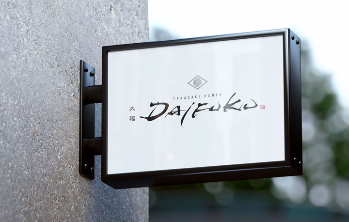
Conclusion
The “DAIFUKU” logo conveys the traditional beauty of Japanese brush script to the modern age while serving as a symbol of the ramen restaurant, hoping to be a beloved presence among customers for a long time to come.

