I had the pleasure of crafting the logo design “Yakitori Torinaga” using calligraphy.
In this article, I will share the background and intentions behind this design.
Concept
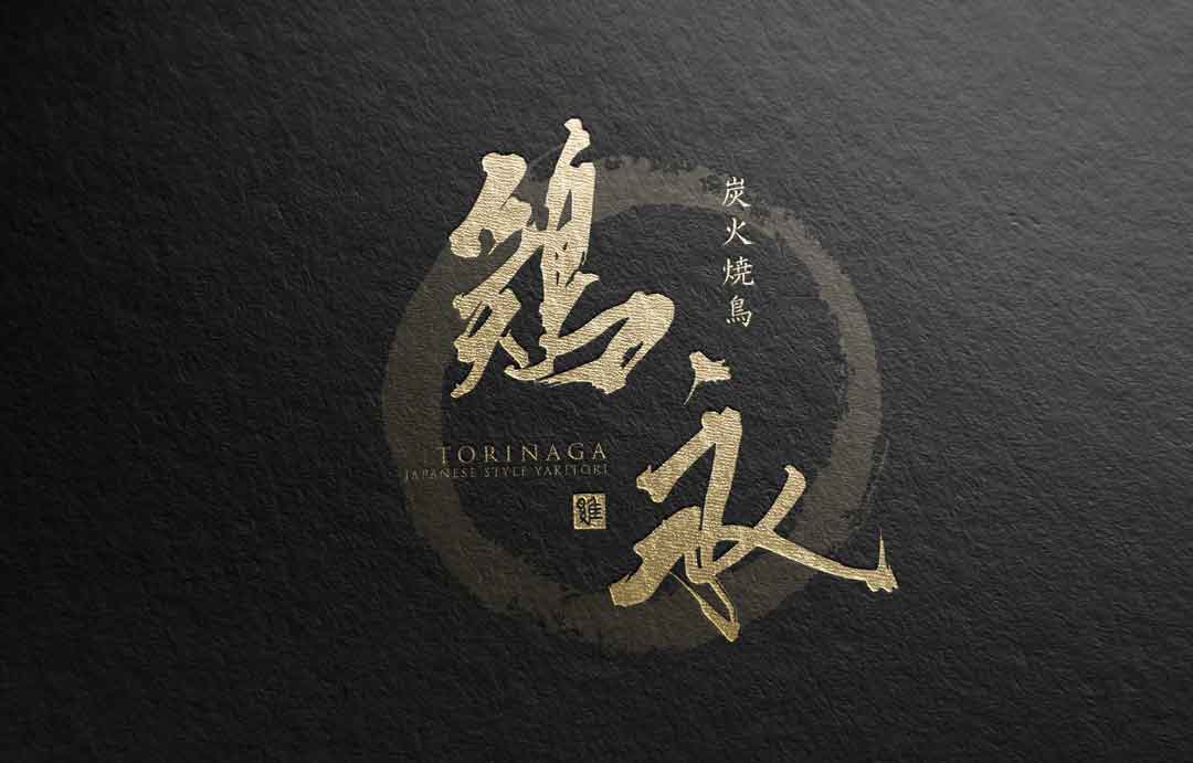
The “Yakitori Torinaga ” logo is centered around the beauty of traditional Japanese calligraphy, aiming for a simple yet striking image.
The design aspires to convey the unpretentious deliciousness of charcoal-grilled chicken through the logo.
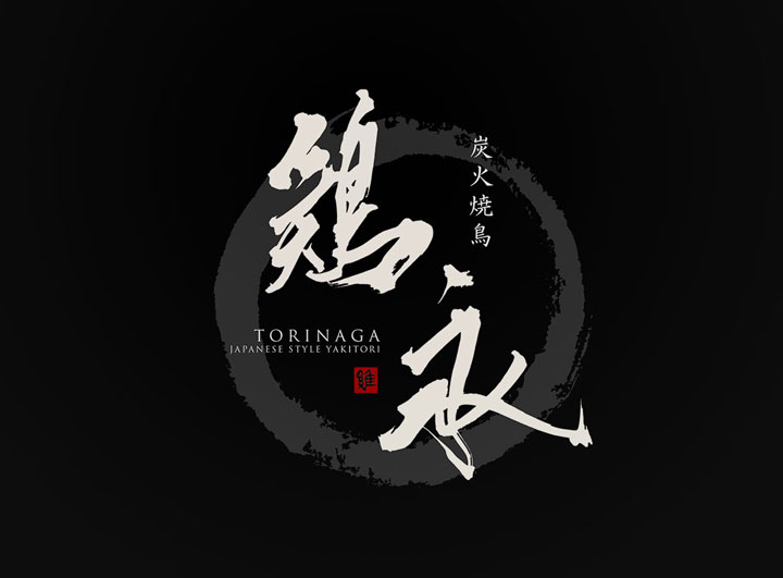
About the Calligraphy
The calligraphy used possesses both the strength and delicacy that evoke Japan’s history.
The movement in each stroke is as lively as flames on charcoal, communicating the energy of traditional script in the modern era.
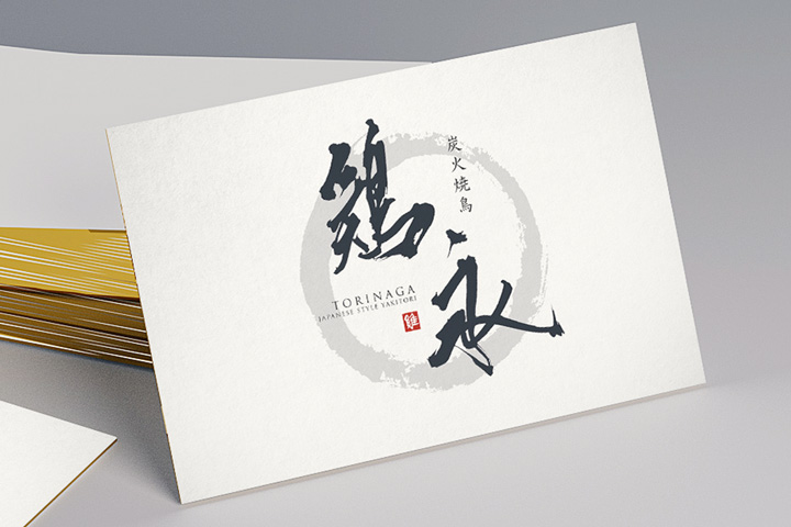
Logo Design Details
The calligraphy commands a simple yet dignified presence.
The circular ink stain invokes images of Japanese nature and designs a sense of power even within stillness.
The red of the seal stamp adds an accent that could be interpreted as either passion or tradition.
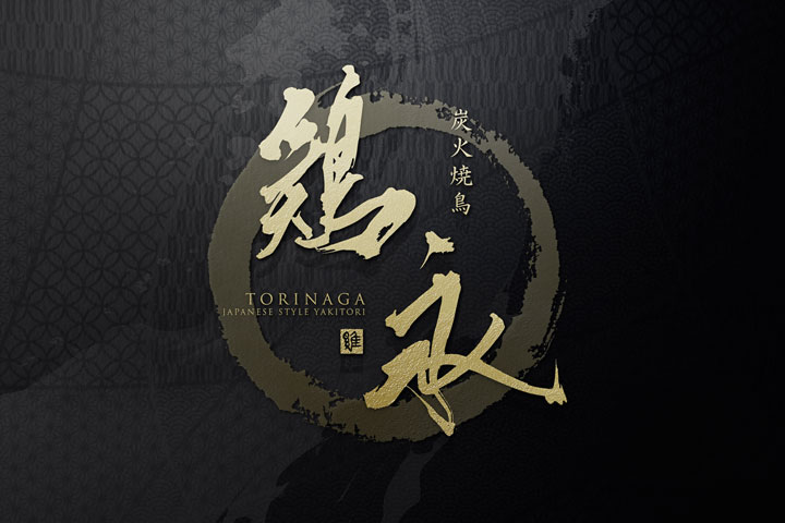
Conclusion
It is my hope that this logo will symbolize the long history and future prospects of “Yakitori Torinaga” and leave a lasting impression on all who visit.
The logo encapsulates our stance of honoring tradition while stepping forward into a new era.

