Izakayas symbolize Japan’s food culture, and each one boasts a logo that shines with its own individuality.
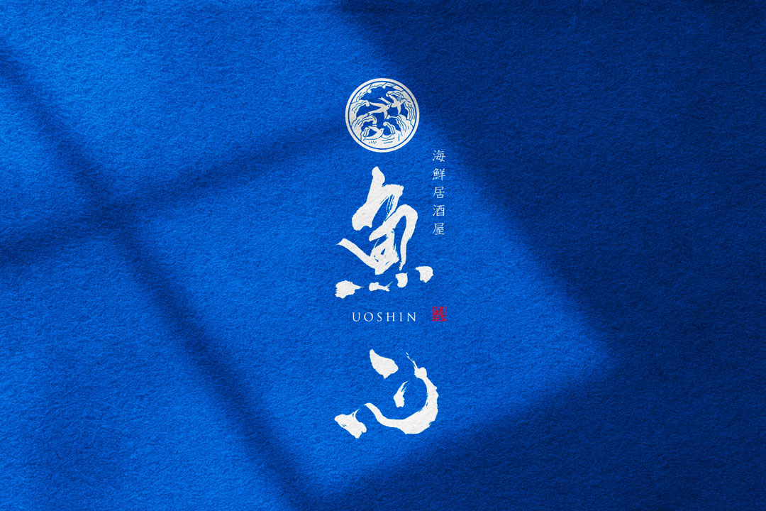
This time, I would like to introduce the logo design for “Uoshin,” a seafood izakaya that abundantly uses the blessings of the sea, which I have designed in the past.
Concept
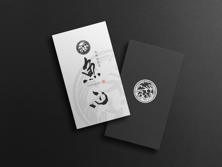
The logo design for “Uoshin,” a seafood izakaya, was created with the concept of blending traditional Japanese beauty with modern sensibility.
Emphasis was placed on expressing the richness of seafood as a material and the warmth of the izakaya space through the use of traditional Japanese brush calligraphy.
About the Calligraphy
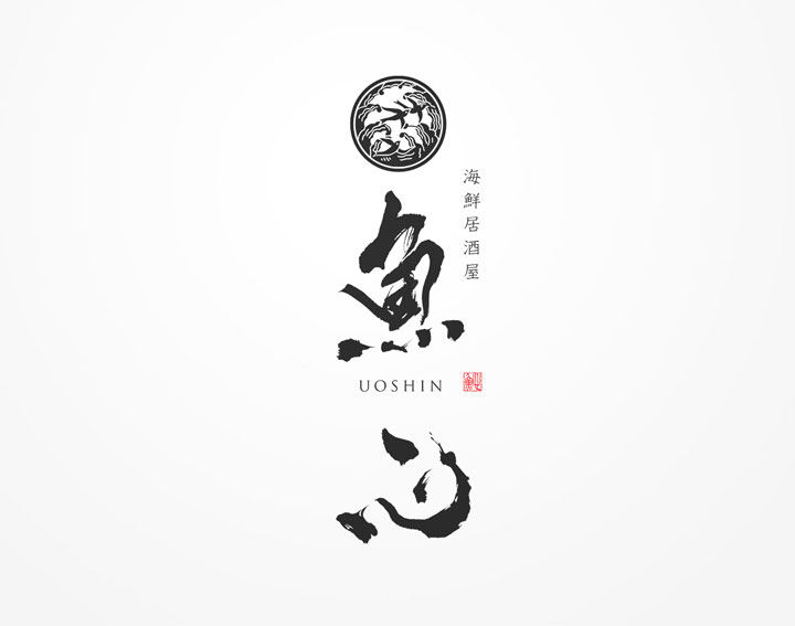
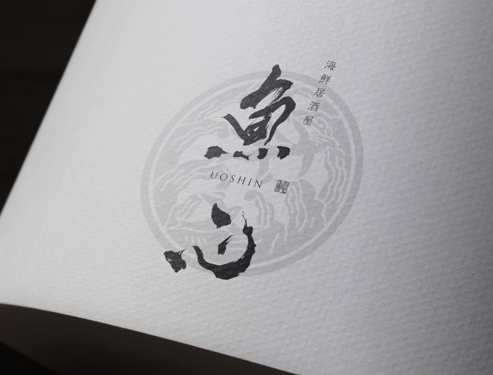
The two characters for “Uoshin,” placed at the center of the logo, are drawn with a brush stroke that is both powerful and delicate.
The brush calligraphy expresses the lively sensation of fresh fish and the magnificence of the sea.
Logo Design Details
At the top of the logo, a family crest design that imagines waves is placed, representing the unique characteristics of a seafood izakaya.
In addition, the red seal stamp symbolizes the “heart” of the restaurant’s name and functions as an eye-catcher that enhances visibility.
Simple yet noticeable, the logo stands out even from afar, highlighting the presence of “Uoshin.”
Conclusion
The logo design for “Uoshin,” a seafood izakaya, has shaped the harmony woven by tradition and modernity.
We hope that this logo design, expressing the warmth of brush calligraphy and the spirit of hospitality towards people, will weave new stories for customers every time they open the door to the izakaya.
Other Introduction
8 Izakaya Restaurant Logo Design Ideas

