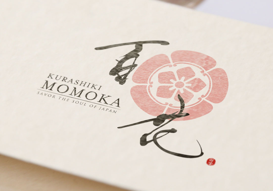
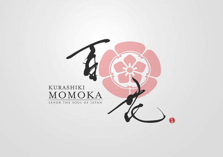
The logo of Café “MOMOKA” has been crafted with an emphasis on clear and thoughtful design, while preserving the traditional brush strokes.
It is our hope that the sentiment behind it resonates with you as we share the story of its creation.
Concept
The “MOMOKA” logo symbolizes the rich nature and culture of Japan.
The name of the café, “MOMOKA,” suggests a variety of flowers in full bloom, representing a gathering place for diverse individualities.
To reflect this concept in the logo, we aimed to create a design that harmonizes Japanese tradition with modernity.
About the Calligraphy
The brush writing used embodies flowing curves and suppleness.
The unique rhythm and balance of each character generate a visual warmth.
Logo Design Details
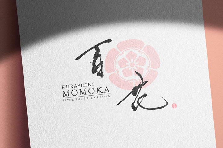
At the heart of the logo is a pink, family crest-style design.
Its soft hues and charming appearance have been crafted to maintain sophistication throughout, while also providing a friendly and approachable impression.
Conclusion
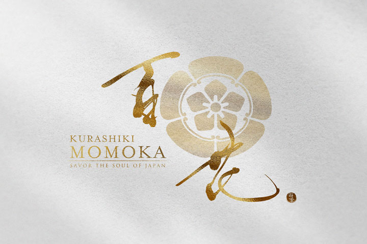
The “MOMOKA” logo is a fusion of Japanese tradition and modernity in design.
We hope this logo will become a part of the serene time and space for our customers.
Moving forward, we will continue to cherish the beauty of Japan while seeking new designs.

