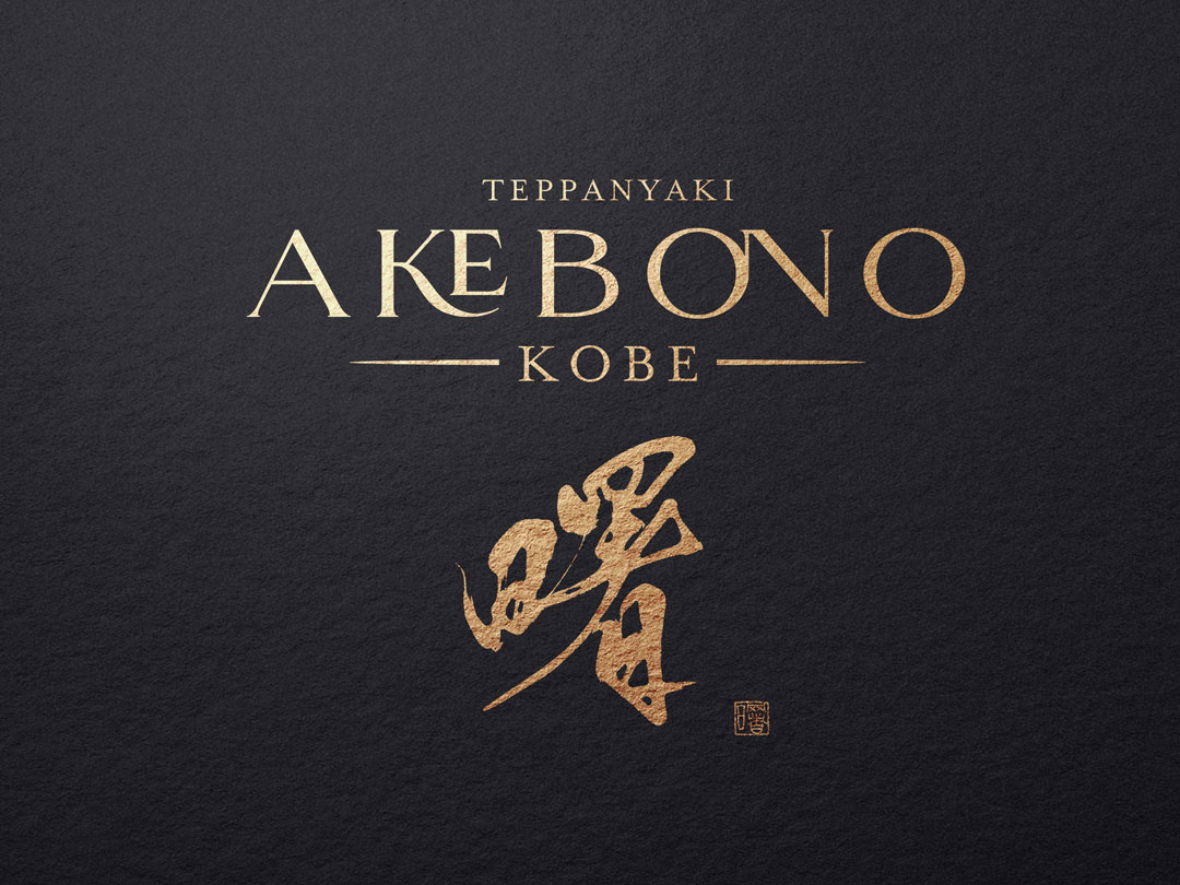
Today, I would like to introduce you to the logo design of ‘Akebono,’ a teppanyaki restaurant that evokes the deep flavors of Japanese tradition.
Concept
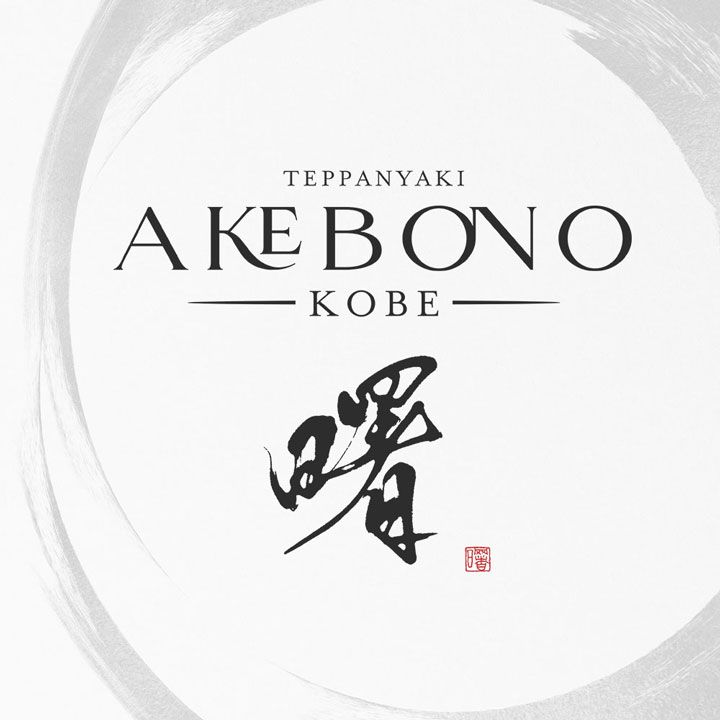
The ‘Akebono’ logo was created with the desire to shape the heart of Japan and cherish its traditions.
‘Akebono’ refers to the light before dawn, symbolizing a new beginning and hope.
In line with the restaurant’s concept, the logo represents a commitment to fresh ingredients and the precious moments of starting anew.
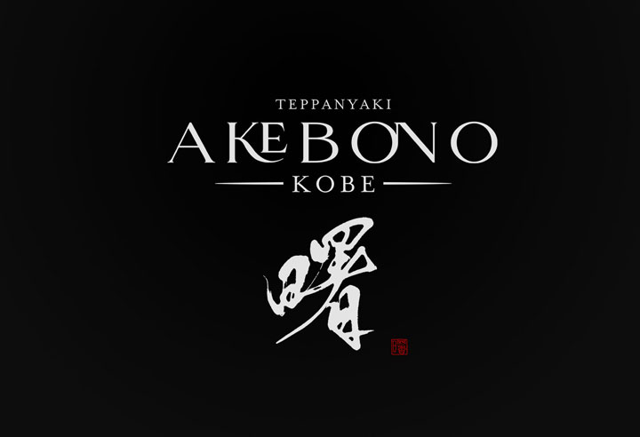
About the Calligraphy
The brush writing features unique warmth and movement created by the pressure and flow of the brush, evoking the hot and emotional dining experience of teppanyaki.
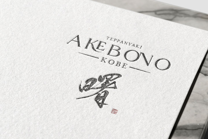
Logo Design Details
While maintaining a modern yet classical beauty, the logo is designed for readability.
‘TEPPANYAKI’ is placed on the upper left and ‘KOBE’ on the lower right, incorporating English to convey the name and location to both domestic and international guests.
The design is kept simple overall, focusing on the beauty of the characters themselves.
Conclusion
The ‘Akebono’ logo is not just eye-catching but respects the culture and craftsmanship behind teppanyaki.
This design, where the strength and delicacy of traditional Japanese brush writing coexist, sends a warm welcome message to visitors, like the light of dawn signaling the start of a new day through the meal.

