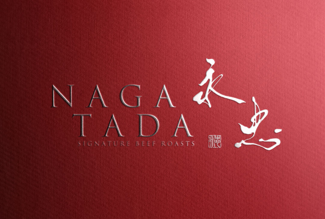
I have created the logo design for the roast beef specialty store “NAGATADA 永忠”.
In this article, I will discuss the background of this simple yet attractive logo.
Concept
The core of the logo design lies in utilizing the unique nodes and elegant flow of Japanese brush script, while adapting it to modern scenes.
The concept behind the “NAGATADA 永忠” logo design is to create a new culture of roast beef.
About the Calligraphy
The lines are somewhat thin, giving an elegant impression.
The flowing curves of the brush script symbolize the tenderness and juiciness of roast beef, stirring the imagination of taste in those who see it.
Logo Design Details
The fusion of English letters and brush script reflects the store’s stance of valuing Japanese tradition while having an international perspective.
Additionally, the addition of a red seal enhances the brand identity strongly.
Conclusion
The “NAGATADA 永忠” logo is not only eye-catching but also tells a memorable story that, along with the store’s beliefs, is deeply engraved in the memories of customers.


