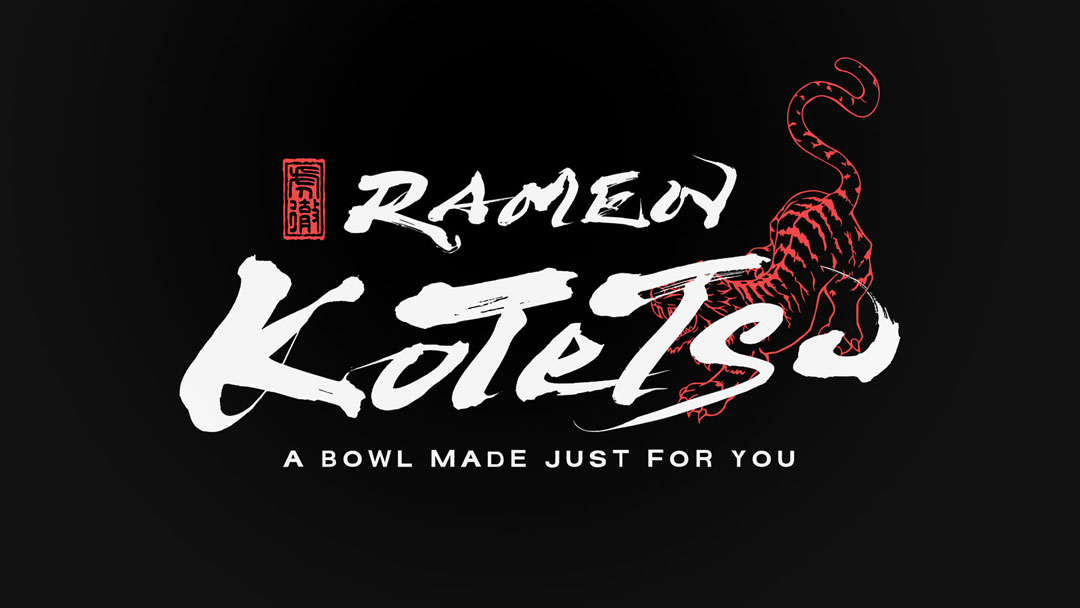
Here, I would like to introduce the logo for the ramen restaurant I designed, “RAMEN KOTETSU 虎徹”.
This logo design emphasizes the beauty of traditional Japanese brush script.
Concept
The name “虎徹” (Kotetsu) is inspired by the famous Japanese sword “Kotetsu,” which is a traditional craftwork that Japan is proud of globally.
The message embedded in this logo is the inheritance of the spirit of this renowned sword, conveying the dedication of utmost skill and heart in every bowl of ramen served.
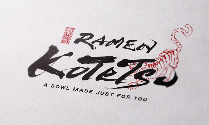
About the Calligraphy
The brush script is characterized by its flowing curves and powerful strokes.
It leverages the techniques of traditional Japanese calligraphy while incorporating the alphabet, a symbol of Western culture.
This fusion expresses the integration of Eastern and Western cultures.
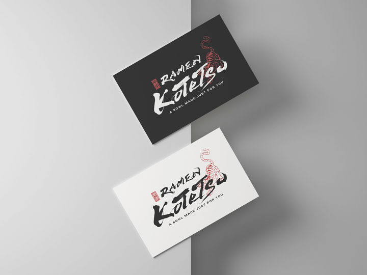
Logo Design Details
Although simple, the logo creates an eye-catching visual effect with a strong red tiger and black brush script, producing a striking contrast.
By varying the thickness, angle, and speed of the brush, movement and rhythm are also expressed in the alphabet characters.
Conclusion
The “RAMEN KOTETSU 虎徹” logo, while preserving traditional elements, reflects the constantly evolving nature of ramen, aiming to create a brand that is loved by all.
It symbolizes a place where the passion poured into every bowl of ramen resonates with the supporting traditions, hoping that this logo will remain in the hearts of our customers for a long time.
Other Introduction

