At SANTEN Design, we specialize in creating martial arts logos that harness the expressive power of traditional Japanese brush calligraphy.
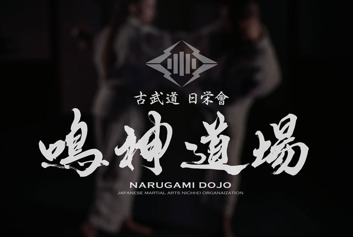
In this case study, we introduce a logo designed for a traditional Kobudo dojo, where we sought to visualize the values of discipline, harmony, and heritage through powerful brushstrokes.
With a deep respect for tradition and martial philosophy, we approached this design to embody the spirit behind the art.
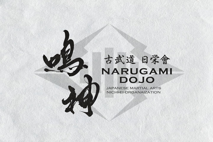
Background: Designing the Logo for “Narukami Dojo”
Narukami Dojo is a martial arts school dedicated to preserving and passing down the teachings of classical Japanese martial arts.
The goal of the logo was to express:
- Strength and serenity
- A martial spirit that transcends time
- The refined beauty of tradition
By utilizing dynamic brush calligraphy, we aimed to reflect these principles through every stroke.
Concept: More Than Just a Martial Arts Logo
A successful martial arts logo should do more than simply represent the name of the dojo — it must capture the atmosphere, philosophy, and energy of the space.
For the Narukami Dojo logo, we focused on:
- Powerful, weighted brushstrokes full of presence
- Form that echoes Japan’s traditional aesthetics
- A composition that balances stillness and intensity using negative space
We also incorporated the dojo’s free spirit and harmony with nature into the design.
Design Focus: Bringing the Dojo’s Energy to Life
What we prioritized most in this project was the ability for the logo to convey the feeling one gets when stepping into the dojo — a quiet but potent atmosphere.
Our approach included:
-
Merging sharp, linear strength with the organic flow of ink
-
Expressing a quiet, natural confidence rather than intimidation
-
Honoring the depth and dignity that defines traditional martial arts culture
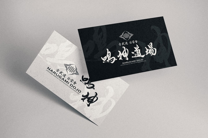
Why Brush Calligraphy Works for Martial Arts Logos
Brush calligraphy logos can communicate more than appearance — they evoke spirit, philosophy, and presence.
This makes them especially powerful for martial arts brands and dojos, where tradition, respect, and intensity are central.
The visual weight and refined aura of brush calligraphy elevate a dojo’s brand image and connect with students on a deeper level.
The Appeal of Brushstroke Logos
We believe that brushstroke logos go beyond mere visual design — they have the power to convey atmosphere and spirit.
This is especially true in fields such as Kobudo and martial arts dojos, where the gravity and elegance of brush calligraphy significantly enhance the brand image.
Conclusion
Not limited to Kobudo, anything that has been passed down through generations contains a deep spirit that often cannot be seen on the surface.
Through the brush, we at SANTEN Design strive to express these intangible elements piece by piece.
We will continue refining our craft over time to create works of even greater depth and meaning.
Other Introduction
Karate Dojo Logo Design – Seishikai

