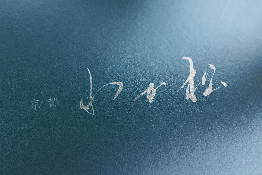
In Kyoto, where the essence of Japan’s scenic beauty is preserved, the esteemed ryotei “Kyoto Wakamatsu” has unveiled a new logo.
We are delighted to introduce the background of its creation and the allure of its design.
Concept
The logo of “Kyoto Wakamatsu” aims to maintain the dignity of a traditional ryotei while incorporating a sense of familiarity and comfort that can be warmly felt by visitors.
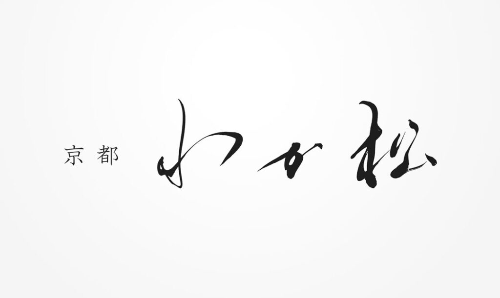
About the Calligraphy
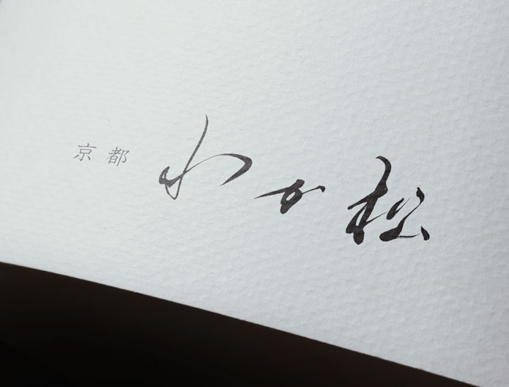
The calligraphy used in the logo respects classical typography but also infuses a modern interpretation with its freehand brushwork.
The strength and delicacy coexisting in these characters symbolize the culinary culture and hospitality spirit offered by the ryotei.
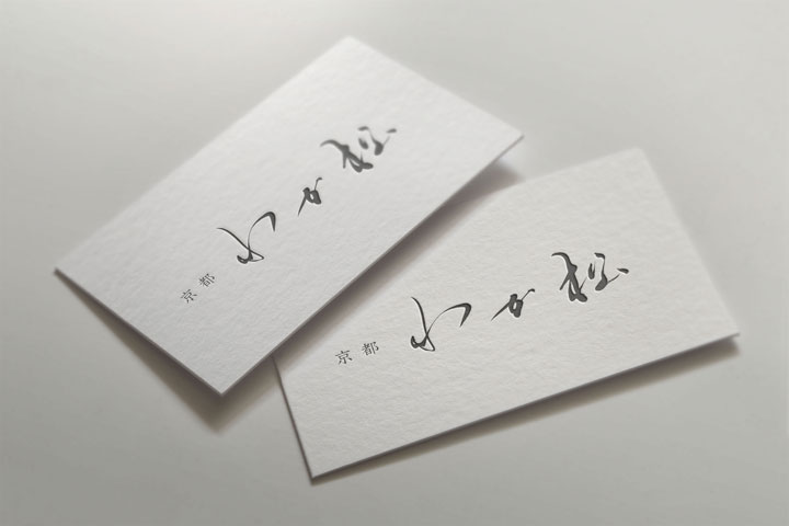
Logo Design Details
The designed logo, while simple, possesses a calculated structure that achieves a visually pleasing balance.
The use of negative space expresses tranquility and the beauty of emptiness.
Conclusion
The new logo of “Kyoto Wakamatsu” represents a fusion of tradition and innovation, symbolizing a new chapter for the ryotei.
We hope that this logo will become a memorable emblem of the ryotei for each and every guest.

