A company’s logo plays a crucial role in shaping its first impression.
Each design carries the brand’s spirit, intentions, and unique identity.
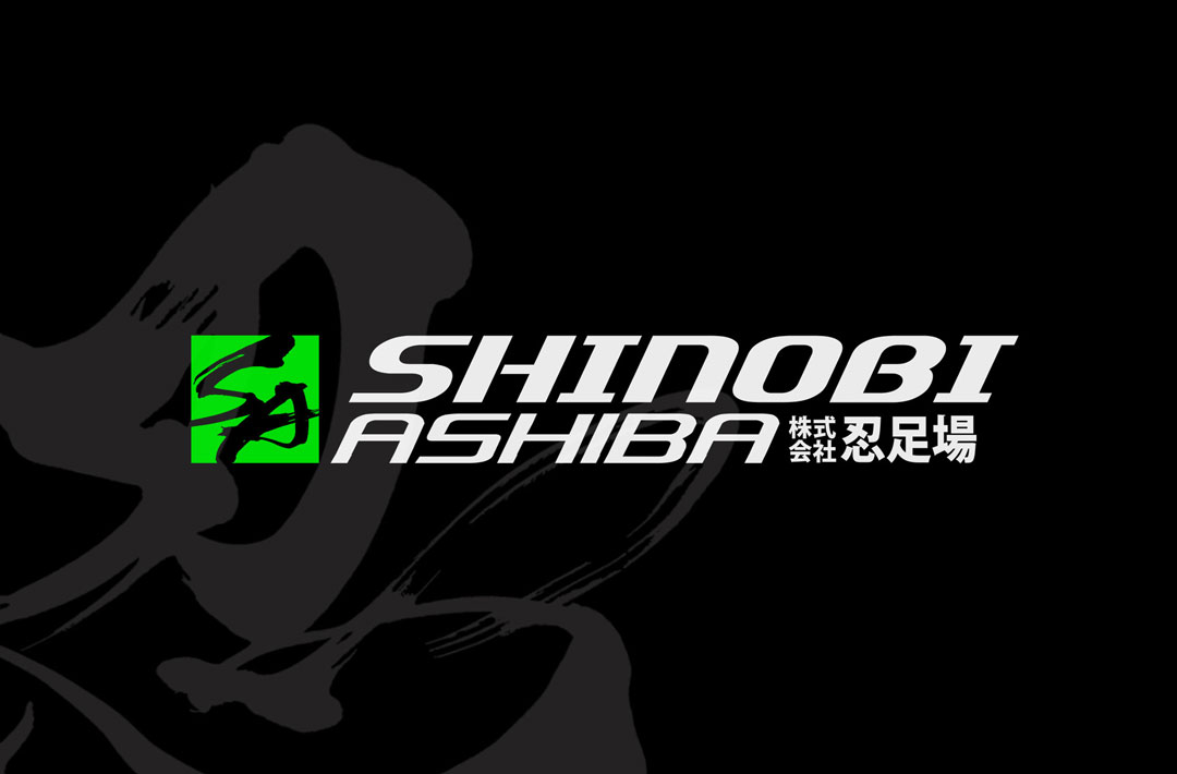
Today, we would like to introduce a logo design project that emphasizes speed, the balance between stillness and motion, and a touch of Japanese aesthetics.
Overall Concept
For this project, we aimed to create a logo that conveys innovation and strength.
We selected a highly legible typeface as the foundation, incorporating an italicized font to express the company’s drive forward and agility.
The color scheme combines neon green and black, achieving a strong visual contrast that instantly captures attention.
Integrating Japanese Elements for Distinctiveness
To add a distinctive Japanese touch, we incorporated the kanji character 「忍」(shinobi) on the right side of the logo, styled in a brushstroke-inspired manner.
The brushwork balances power and tranquility, subtly communicating a sense of Japanese spirit and aesthetic refinement.
Through this design, we believe the quiet strength and cultural depth unique to Japan are naturally conveyed.
Practical Color Variations
Recognizing that logos appear differently depending on the medium and background, we prepared two color variations:
- Black background × Neon Green logo: Creates a bold and powerful impression.
- Green background × Black logo: Offers a striking, contemporary look.
By considering various applications such as advertising and web design, we ensured a highly versatile and practical logo deployment.
Final Thoughts
We believe that pursuing “coolness” in logo design is an essential way to enhance a brand’s appeal and presence.
We will continue to approach each project with care and dedication, striving to deliver designs that offer true value to our clients.
Other Introduction
Creating a Memorable Brand Identity with Japanese Brush Calligraphy


