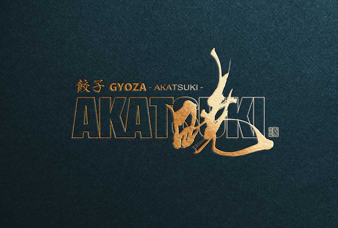
We have designed a logo for the specialty gyoza restaurant “Gyoza Akatsuki.”
This logo incorporates traditional Japanese elements while blending a modern sensibility.
Below, we introduce the concept and features of the logo design.
Concept
The logo design for “Gyoza Akatsuki” expresses the image of a new beginning and dawn, as implied by the store’s name “Akatsuki.”
The design aims to be simple yet powerful, symbolizing the store’s dedication.
About the Calligraphy
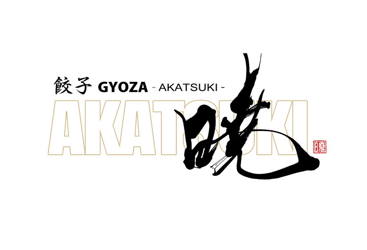
The calligraphy embodies both strength and softness, representing the craftsmanship and meticulous work of the gyoza specialty restaurant.
The flow and rhythm of the brush strokes leave a deep impression on the viewer, emphasizing the store’s uniqueness.
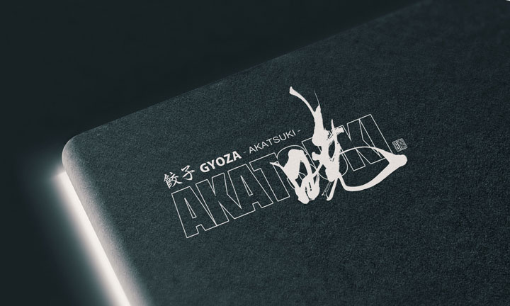
Logo Design Details
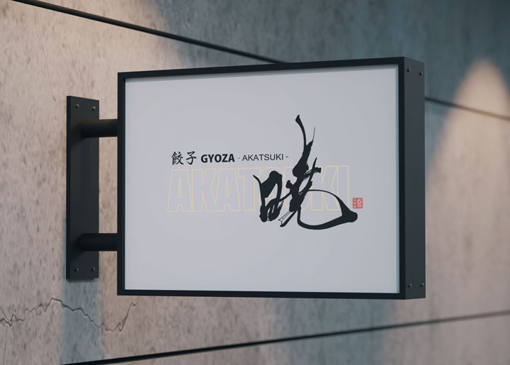
The store name “GYOZA AKATSUKI” is placed slightly above the center on the left, creating a design that is easy for both domestic and international customers to understand.
The background features a large depiction of “AKATSUKI” in a subtle gold color, adding depth and uniqueness to the brand.
A seal is placed in the bottom right corner, adding a sense of trust and elegance to the overall logo.
Summary
The logo design for “Gyoza Akatsuki” skillfully combines traditional and modern elements, visually expressing the store’s dedication and passion.
We hope this logo will enhance the brand image of “Gyoza Akatsuki” and make it a beloved restaurant for many customers.

