In the branding of hair salons and beauty parlors, the logo plays a crucial role in forming the first impression.
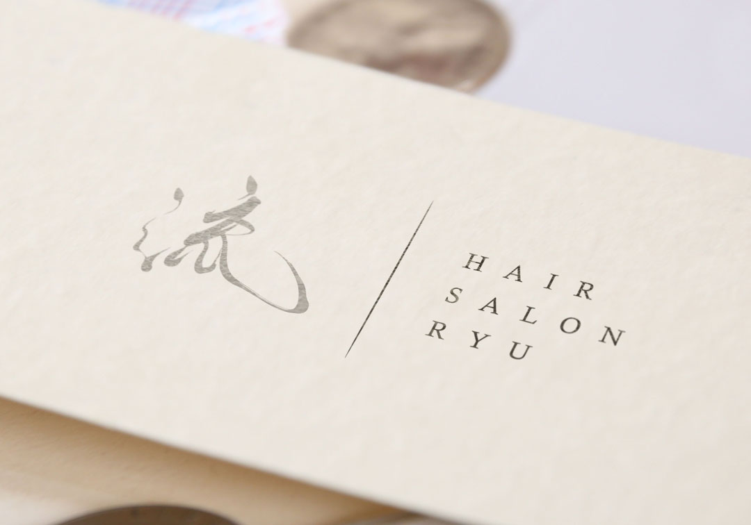
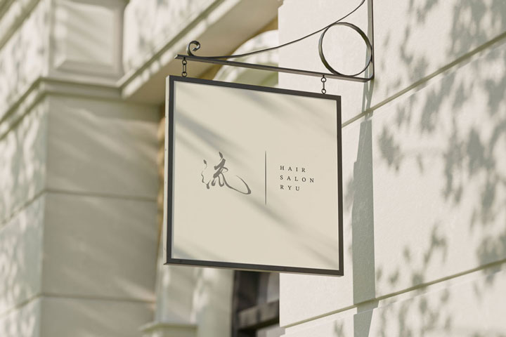
Today, we’d like to introduce a logo design for the salon “流 – Ryu”, which beautifully merges the elegance of brushstroke calligraphy with a modern composition.
The logo gently expresses images such as “the flow of hair,” “the passage of time,” and “the flow of the heart” through a single, deliberate brushstroke.
The Meaning Behind the Logo: The Power of the Character ‘流’ (Ryu)
The brand name ‘流 (Ryu)’ holds multiple layered meanings:
- Flow of hair: The natural movement of beautifully styled hair
- Flow of time: A calm, healing atmosphere where time gently flows
- Flow of style: The salon’s unique philosophy and aesthetic
The flexibility and strength of water: The power to maintain one’s beauty while adapting to change
This single character gracefully embodies the worldview of the entire brand.
Design Highlights: Harmony Between Brushstroke and Western Typography
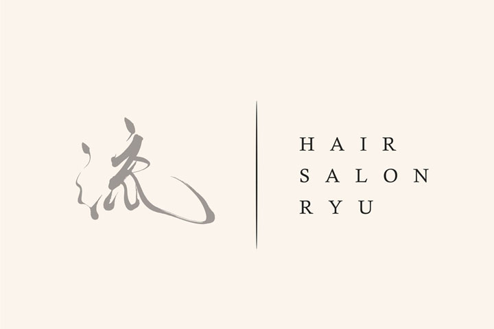
This logo stands out for its balance between the brushstroke character “流” and the clean Western typeface “HAIR SALON RYU.”
- The brushstroke calligraphy retains the rhythm of traditional script while presenting a modern and stylish impression.
- The English lettering is arranged vertically, creating a sense of white space and tension, contributing to a refined, Wa-modern aesthetic.
- The subdued greige color fits naturally with the salon’s interior tones, subtly enhancing an organic sense of beauty.

The Role of the Logo Aligned with the Brand Concept
At Hair Salon Ryu, the concept is “hair design that naturally complements the customer’s lifestyle.”
Therefore, the logo was designed to “leave a strong impression without being too assertive.”
The organic lines of the calligraphy paired with the minimalist Western text—
This contrast beautifully represents the harmony of stillness and movement.
Conclusion: A Logo That Captures the Atmosphere of the Salon
At Hair Salon Ryu, the concept is “hair design that naturally complements the customer’s lifestyle.”
As such, the logo had to be something that doesn’t shout for attention, yet leaves a lasting impression.
The flowing brushstrokes and minimal typography embody the essence of quiet elegance.
This balance tells the story of the salon’s atmosphere through design.
Other Introduction
Creating a Memorable Brand Identity with Japanese Brush Calligraphy

