Izakaya Logo Design Ideas
Izakaya refers to restaurants that serve mainly Japanese-style food and beverages such as sake, beer, and other brewed alcoholic beverages.
If categorized more finely, izakaya also include restaurants called “yakitori-ya,” “oden-ya,” or “koriyaki-ya. Including such restaurants, the term “izakaya” is generally used to refer to all Japanese-style bars.
A Japanese-style logo design utilizing brush strokes fits well with the atmosphere of an izakaya and can express a unique world view.
Therefore, we would like to introduce some examples of Japanese-style logo designs that we have created in the past for izakaya.
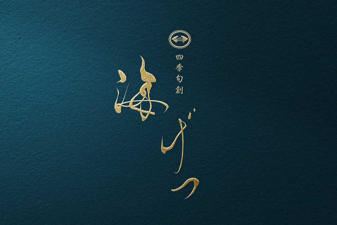
1:Izakaya Restaurant KAIGETSU Logo Design
KAIGETSU means sea and moon in English.
As the name suggests, this izakaya serves seafood from all four seasons of Japan.
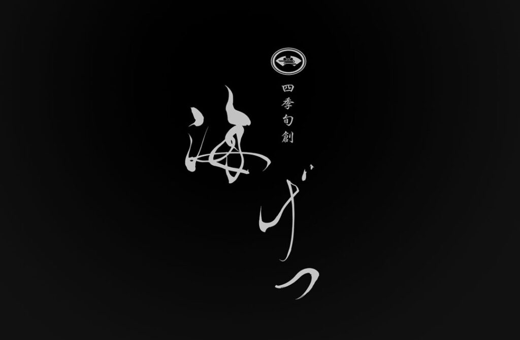
Brushstrokes are designed to represent the flow of waves while maintaining elegance.
The brush strokes represent the flow of waves, while the overall logo design maintains a sense of elegance.
2:Izakaya Restaurant IGARASHI Logo Design
Introducing the logo design for IGARSHI, a yakitori restaurant.
IGARASHI means “fifty storms” in Japanese and is the name of one of the many surnames in Japan.
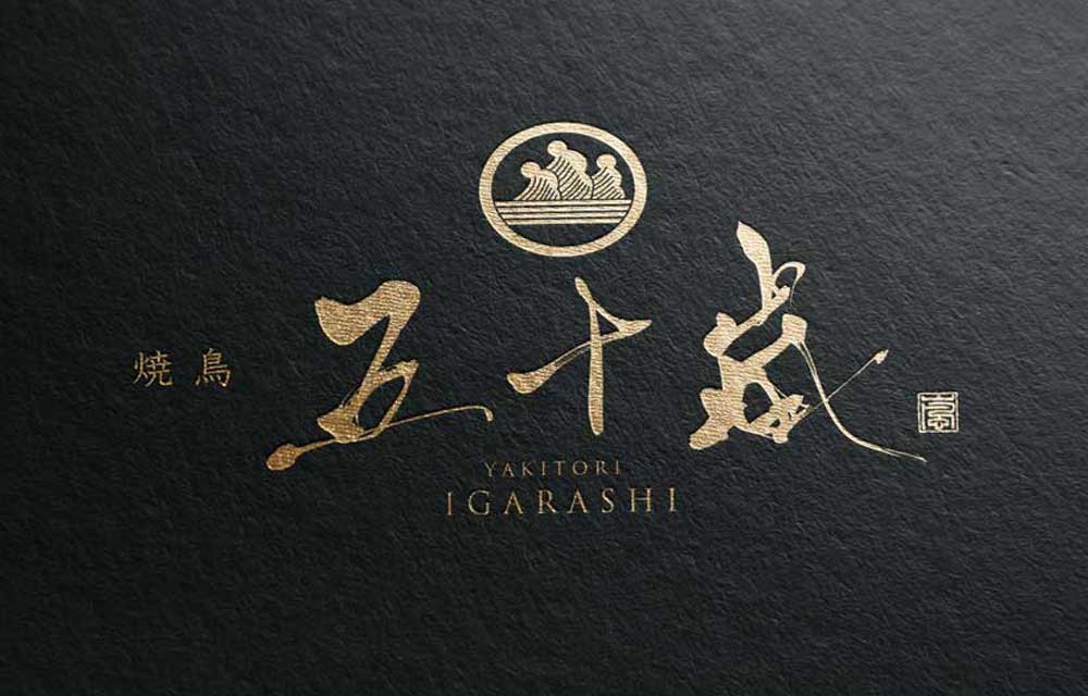
The brush strokes are written in kanji characters as Igarashi. The lines are soft and elongated.
The family crest design is in the Japanese style with a storm motif.
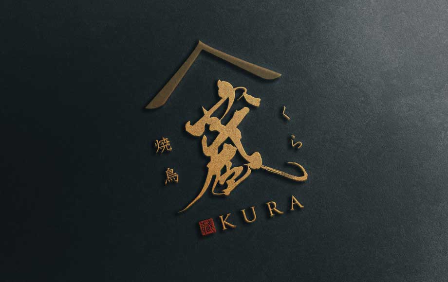
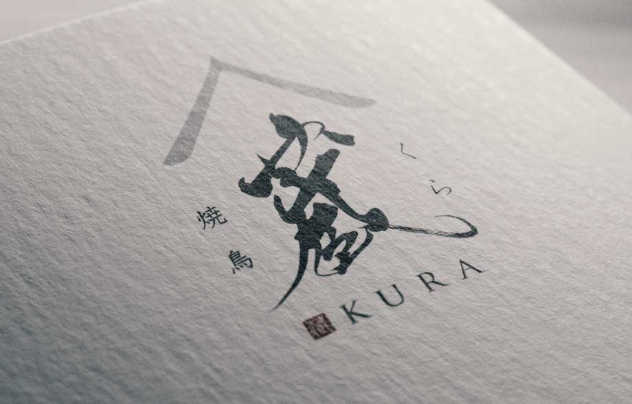
3:Yakitori Izakaya Restaurant KURA Logo Design
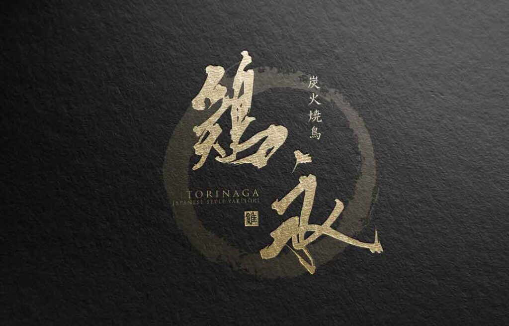
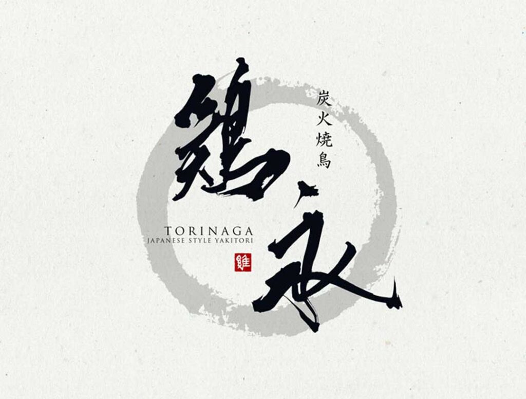
4:Yakitori Izakaya Restaurant TORINAGA Logo Design
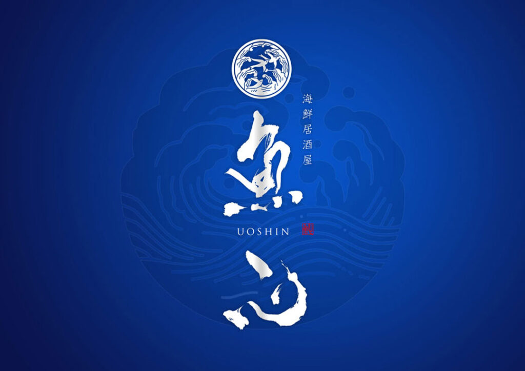
5:Seafood Izakaya Restaurant UOSHIN Logo Design
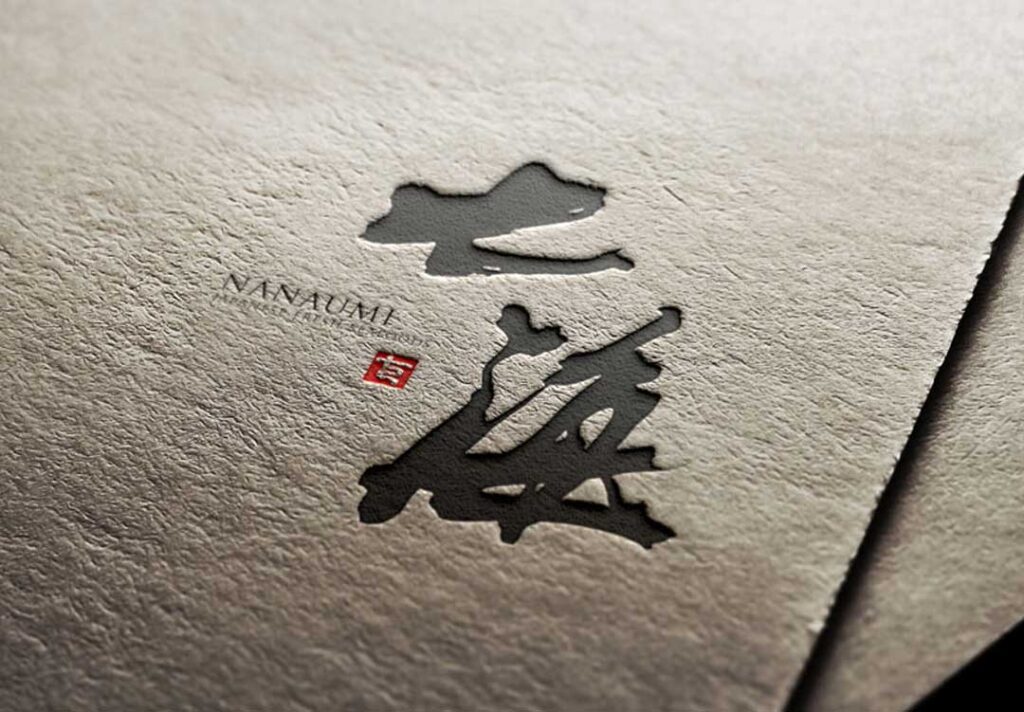
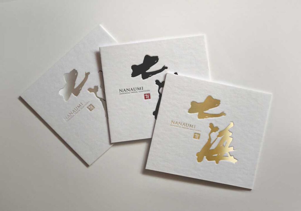
6:Izakaya Restaurant NANAUMI Logo Design
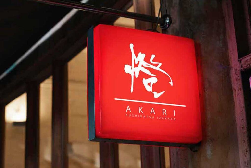
7:Kushikatsu Izakaya AKARI Logo Design
8:Izakaya restaurant HATSUYOSHI Logo Design
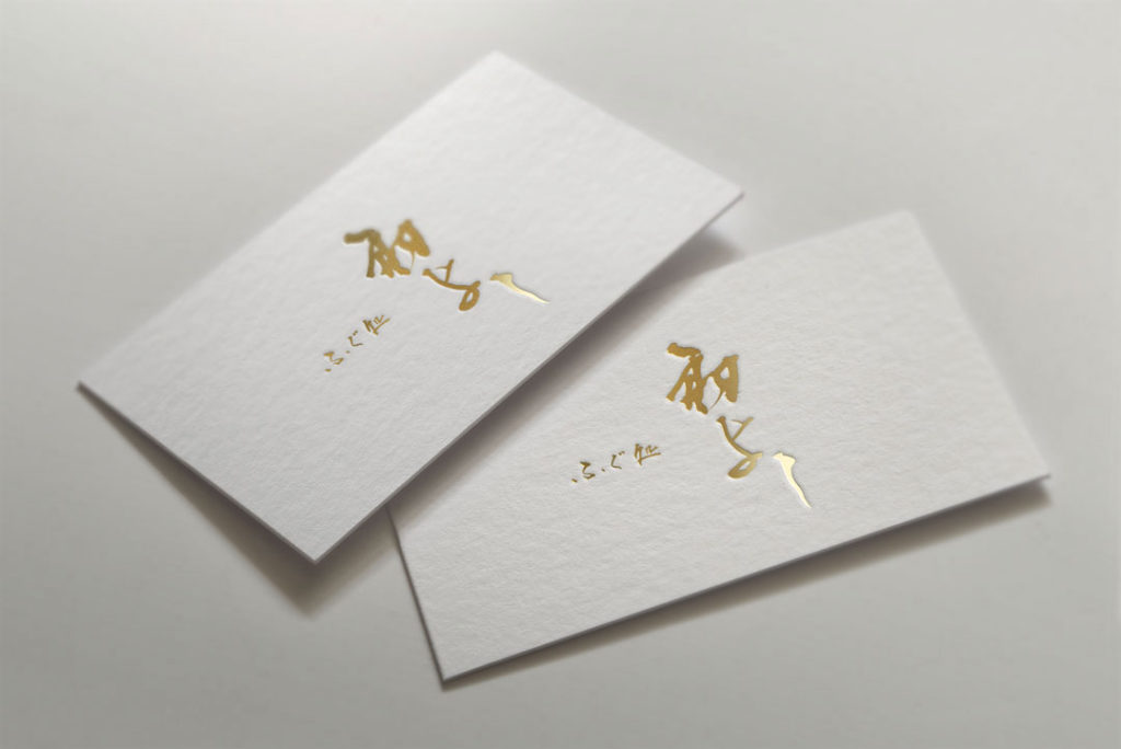
We designed the simple calligraphic logo that has a good legibility without adding flashy decorations.
We expressed the round image of blowfish with calligraphic characters “ふぐ処”.
We used rather hard brush for “初よし” to express its tradition and passion.
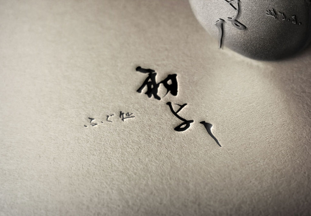
We oriented “ふぐ処” right-to-left and “初よし” top-to-bottom,
and arranged them in a good balance in order to provide a compact design that does not look cramped.
Recommended Related Articles
logo design summary
In this issue, we have introduced an example of a Japanese-style logo design that was suited for an izakaya.
By expressing a Japanese atmosphere, it can better convey the izakaya’s ambience and create an impressive image for customers.
We hope you will find these examples useful when creating your izakaya logo design.
About Us
SANTEN Design is a company specializing in the production of brush lettering logos.
We specialize in the creation of flexible brush lettering logos to suit a variety of uses and requests.
We will be happy to provide you with quotations, consultations on various types of production,
and of course, detailed information on our achievements.
Please feel free to contact us for a quotation.

