Logo design is a crucial element that can be considered the face of any business.
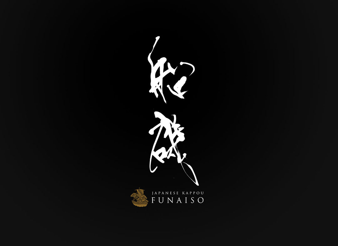
This time, we introduce the logo design of the Japanese restaurant “Kappo Funaiso“, which is themed around the fusion of tradition and modernity.
This design uniquely combines respect for traditional Japanese aesthetics with a contemporary sense, creating a distinctive appeal.
Concept
The main concept of the logo design for “Kappo Funaiso” symbolizes the tradition and sophistication of Japanese cuisine.
Japanese cuisine is characterized by its simple yet deep flavors that bring out the taste of the ingredients, and this spirituality is reflected in the logo.
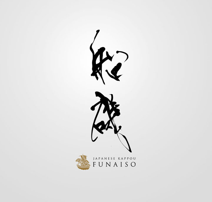
The brush lettering incorporates the beauty and flow of traditional Japanese calligraphy to express this spirituality.
Each stroke in the logo’s characters, like the cuisine itself, is meaningful and has been carefully crafted to give a delicate yet strong impression.
About the Calligraphy
The brush lettering was chosen to strongly express the identity of the Japanese restaurant.
Calligraphy plays an important role in Japanese culture, and the powerful movement of the brush symbolizes the passion in the cuisine and the skill of the craftsmen.
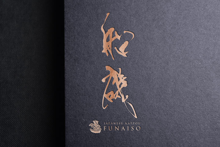
The characters used in this logo represent the name of the Japanese restaurant, “Funaiso,” and the style of the script incorporates both traditional and modern sensibilities.
Logo Design Details
The logo’s composition is divided into two main elements: the brush lettering and the symbol part that includes the restaurant’s name.
The brush lettering is dynamic yet balanced, and the symbol exudes a sense of stability and elegance.
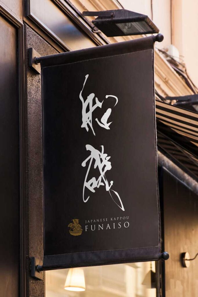
Overall, the balance of the design naturally guides the viewer’s gaze and aims to create a memorable impression.
Conclusion
Thank you for taking a look at the logo design for “Kappo Funaiso” that our company has worked on.
In this project, we endeavored to blend the beauty of traditional Japanese cuisine with a modern, simple style.
We hope that the logo will be meaningful to everyone.

