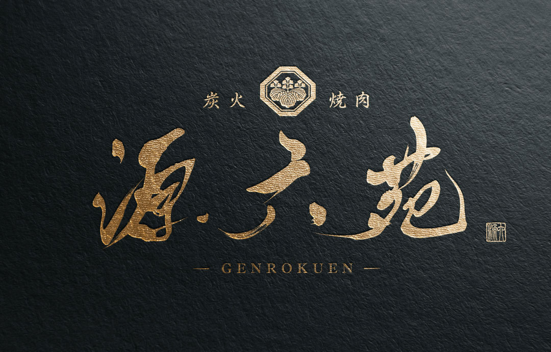
In this blog, I will introduce the design background and features of the logo for “Sumibi Yakiniku Genroku-en”, which I created in the past.
Concept
The concept of Genroku-en’s logo design is “Tradition and Quality”.
As the name of the restaurant suggests, it respects the pursuit of quality in modern food culture while returning to the origins of yakiniku.
To embody this, elements that evoke Japanese tradition have been incorporated.
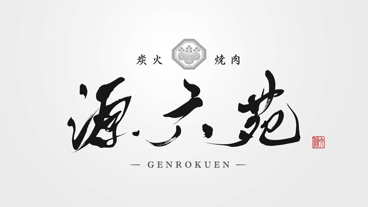
About the Calligraphy
The logo features brush writing. This brush writing has been carefully crafted to represent the beauty of Japanese calligraphy, with particular attention to the thickness and flow of the lines.
The powerful movement of the brush symbolizes the strength and delicacy of the dishes offered by Genroku-en.
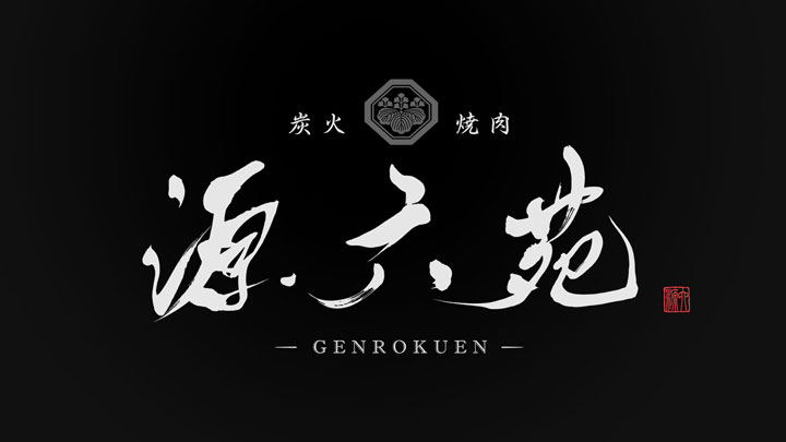
Logo Design Details
The family crest placed in the center of the logo symbolizes the Japanese tradition and the prestige of Genroku-en.
The family crest holds significant meaning in Japanese culture and instantly conveys the idea of a “prestigious taste of tradition”.
Additionally, the red seal in the corner of the logo serves as a visual accent, drawing the eye as a focal point.
Conclusion
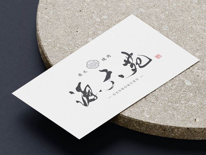
The logo of “Sumibi Yakiniku Genroku-en” has successfully fused traditional beauty with a modern sense, achieving a design that exudes both luxury and a profound sense.
It is our hope that this logo will leave an unforgettable impression on our customers and be loved as the face of our restaurant for a long time.

