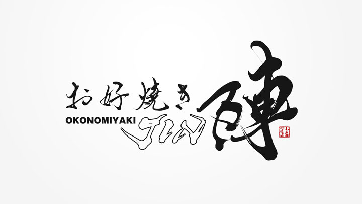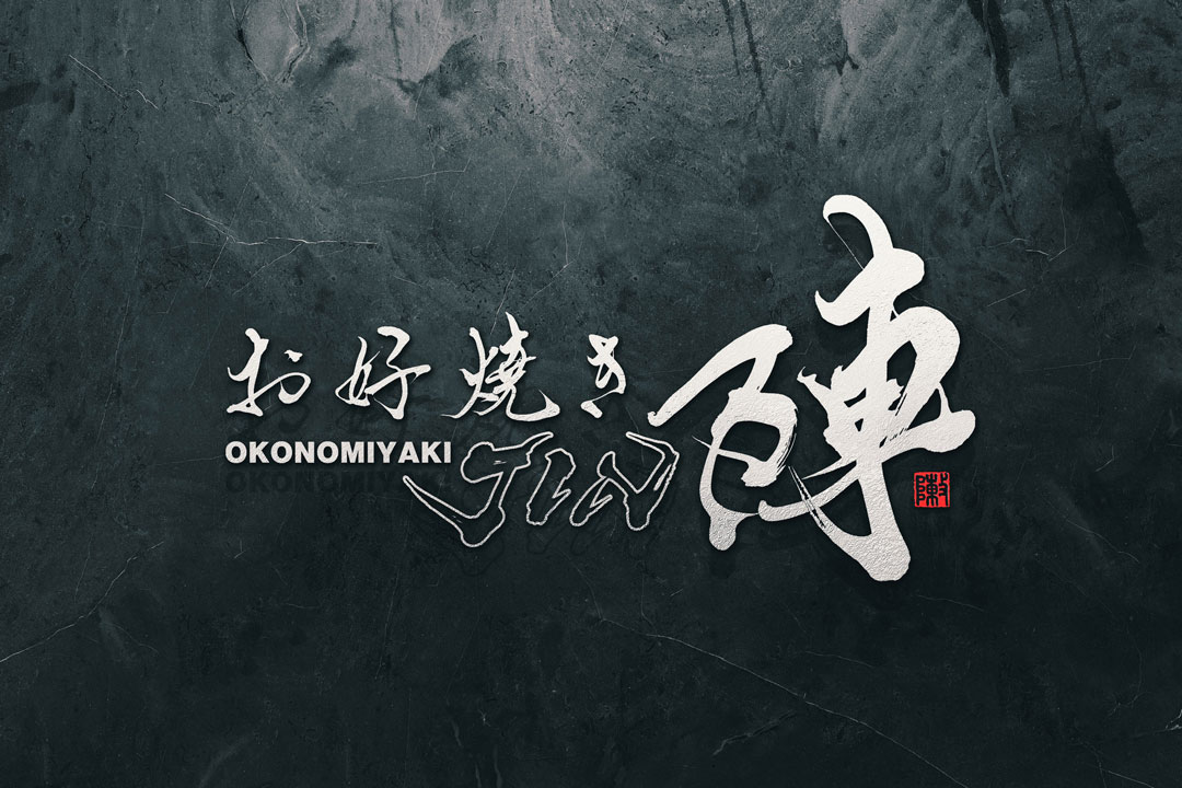
Hello. This time, I would like to introduce the logo I designed for the okonomiyaki restaurant “Jin” in detail.
This logo uses traditional Japanese brush calligraphy and represents the atmosphere of the restaurant.
Concept
The concept of the “Jin” logo design is simple yet powerful, evoking a sense of traditional Japanese culture.
It is fitting for a restaurant that offers okonomiyaki, a soul food of Japan, and cherishes the atmosphere of Japan.
About calligraphy
The brush calligraphy features the momentum and natural flow characteristic of hand-written strokes, conveying warmth and unique personality.
The brush calligraphy gives the restaurant’s name strength and presence, leaving a strong visual impression.
Logo Design Detail
The logo is designed with the characters for “okonomiyaki” and “Jin” at its center, creating a well-balanced composition.
In particular, the character “陣” is placed prominently and powerfully, emphasizing the impact of the store’s name.
Additionally, a red seal stamp mark is added as an accent, enhancing the overall Japanese atmosphere.
Summary
The “Jin” logo design respects traditional Japanese culture while incorporating a modern sensibility.
The beauty and strength of the brush calligraphy harmonize to visually express the restaurant’s concept.
We hope this logo will be cherished by many as a symbol of the okonomiyaki restaurant “Jin.”

