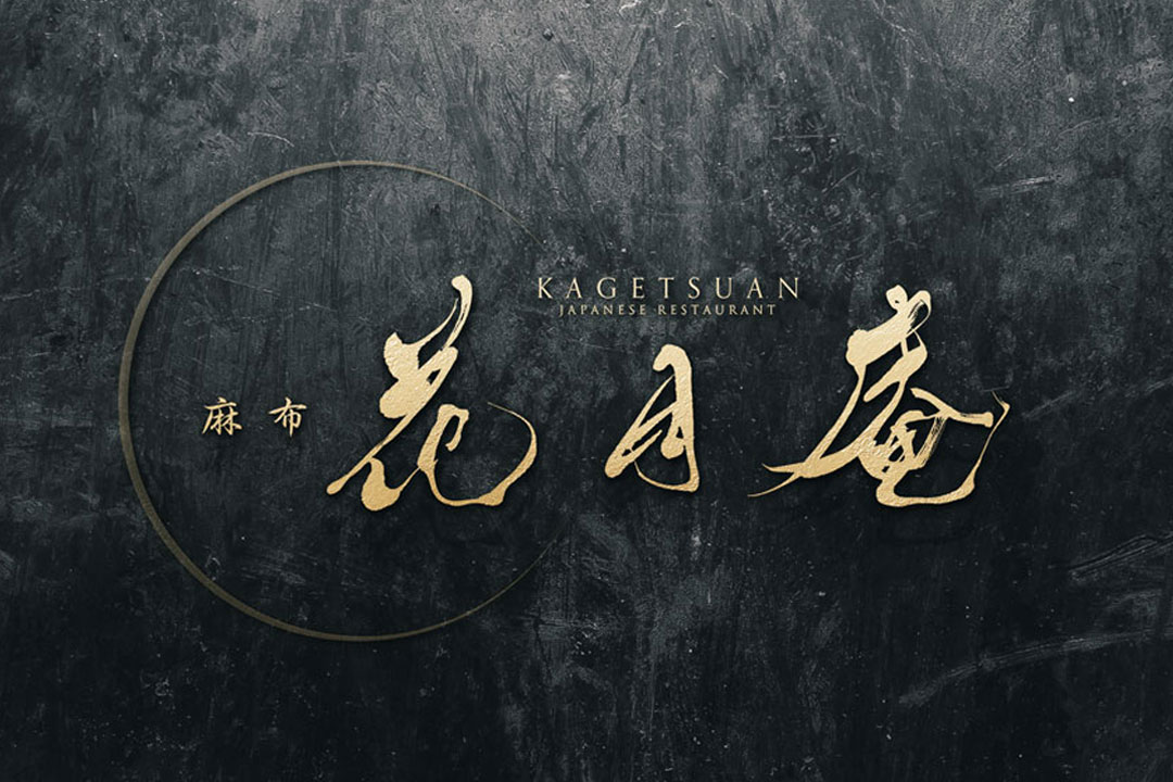
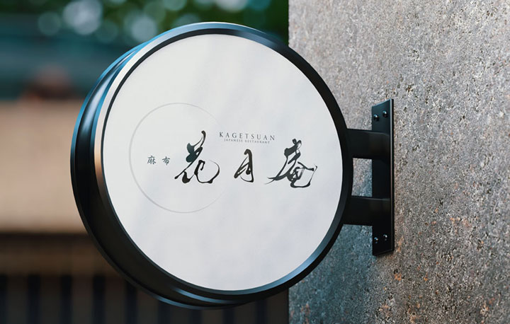
We have infused a breath of modernity into the traditional stroke of the brush to complete the logo design for “Azabu Kagetsuan.”
This logo was born to convey the essence of Japanese cuisine and to express our heartfelt hospitality to our visitors.
Concept
The concept of our logo design is “the tranquil resonance of Wa (Japanese harmony).”
The classic beauty of the calligraphy and the calm atmosphere it creates are in harmony with the rich flavors of the cuisine.
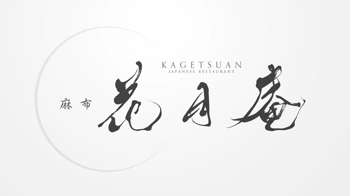
About the Calligraphy
The calligraphy used here values the natural flow and harmony of the Japanese world.
The rhythm and balance of each character represent the ultimate beauty that Kagetsuan’s cuisine strives for.
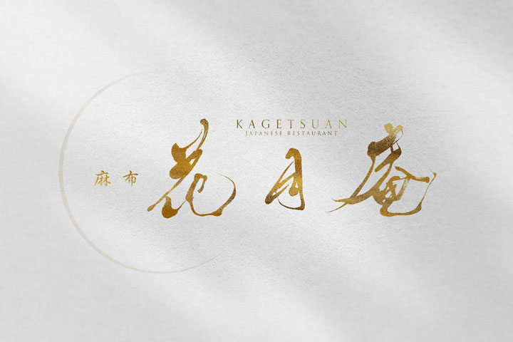
Logo Design Details
The logo was designed with a simple yet meaningful structure in mind.
It symbolizes the dignity of a Japanese restaurant with a calm color scheme, valuing a clean and elegant image.
The contrast between the characters and the background creates an ambiance of the cuisine’s elegance and a relaxing space.
Conclusion
This logo for “Azabu Kagetsuan” represents the world of Japanese harmony woven by tradition and modernity.
We hope that everyone who visits will recall the quality time and cuisine offered by Kagetsuan whenever they see this logo, feeling heartfelt satisfaction and joy.


