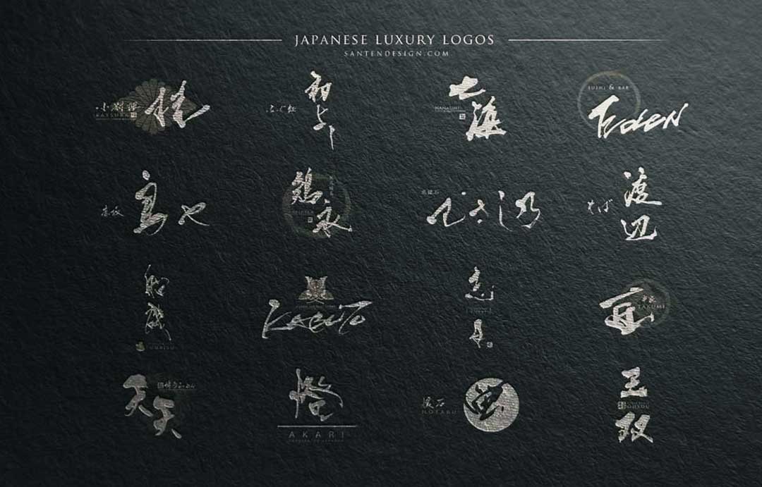
In this article, we would like to introduce you to some of the high-end logos we have created in the past.
We hope you will find them useful for your future logo creations.
1:Luxury Japanese Logo│Sushi Restaurant『YUZEN』
Kappo used to refer to a “cooking method,” but today many restaurants serving high-end Japanese cuisine are called kappo.
『遊 』means play and 『山』 means mountain.
The name is intended to embody the idea of expressing a mountain of many manners and ingredients through kappo, and to play freely with ideas while preserving tradition in the process.
Logo design is. The design is simple, with the symbol based on a circle and containing Japanese kanji characters.
2: Luxury Japanese Logo│Restaurant『KATSURA』
Katsura『桂』 is a deciduous tree that grows in mountainous areas and is beautiful in autumn when it turns yellow and red.
The family crest is a traditional design in the shape of a laurel tree.
The logo design embodied an upscale Japanese restaurant
3:Luxury Japanese Logo│Kyo Kaiseki『SHIZUKI』
『志月』 is pronounced “sizuki” and the logo design features a combination of elegant sounds and kanji characters.
4:Luxury Japanese Logo│Restaurant『FUNAISO』
『船磯』 is a logo design that combines the Kanji characters for ship『船』 and rocky shore『磯』.
The combination of letters works well together, and at a glance, the logo design is recognizable as a restaurant dealing with Japan’s abundant seafood.
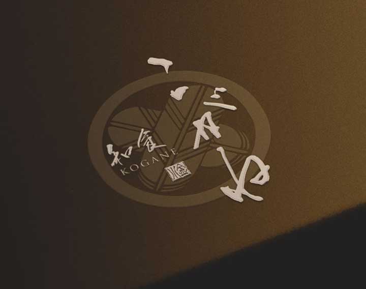
5:Luxury Japanese Logo│Restaurant『KOGANE』
In Japan, ears of rice that have bountifully ripened are sometimes described as “KOGANE-IRO”
The rice bale also resembles the shape of an old gold coin, so it is derived from 00, which also means golden『KOGANE』.
A cohesive logo design based on a circular family crest.
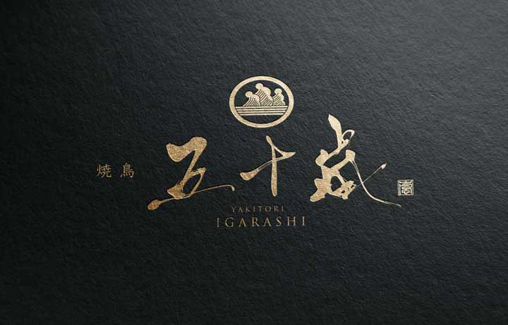
6:Luxury Japanese Logo│Yakitori『IGARASHI』
The etymology of the word 『IGARASHI 五十嵐』 comes from the Ainu word “Inkaruusipe,” meaning “a cliff with a beautiful stream running along it.
It is also a name sometimes used for surnames.
This logo design combines a family crest and brush strokes, giving a sense of tradition.
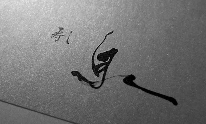
7:Luxury Japanese Logo│Sushi Restaurant『IZUMI』
The etymology of the word “IZUMI 泉” is that of a place where water naturally flows out of the ground.
The name was given in the hope that people would gather at the watering hole and prosper.
This logo design is simple but expresses the flowing out of water.
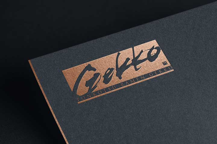
8:Luxury Japanese Logo│Ramen『Gekko』
“Gekko” means moonlight in the Japanese sense.
A logo design with a rectangular feature.
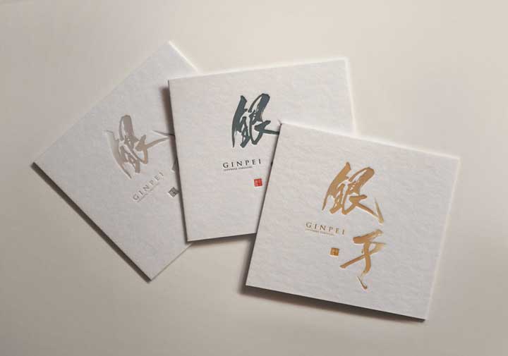
9:Luxury Japanese Logo│Yakitori『GINPEI』
“GIN 銀”means silver and “PEI 平” means flat.
Although these two characters seem to have no connection, in Japanese they are expressed like the name of a person from the past with a sense of history.
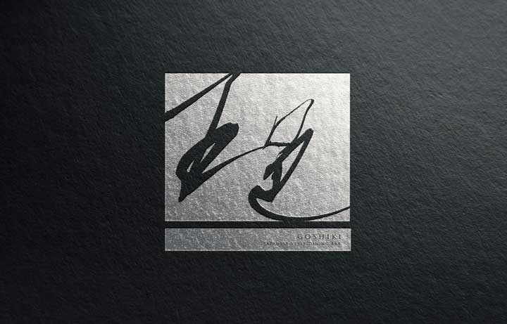
10:Luxury Japanese Logo│Restaurant『GOSHIKI』
“GOSHIKI 五色” means five colors.
Logo design with square features.
Brushstrokes can be used as a contemporary logo design.
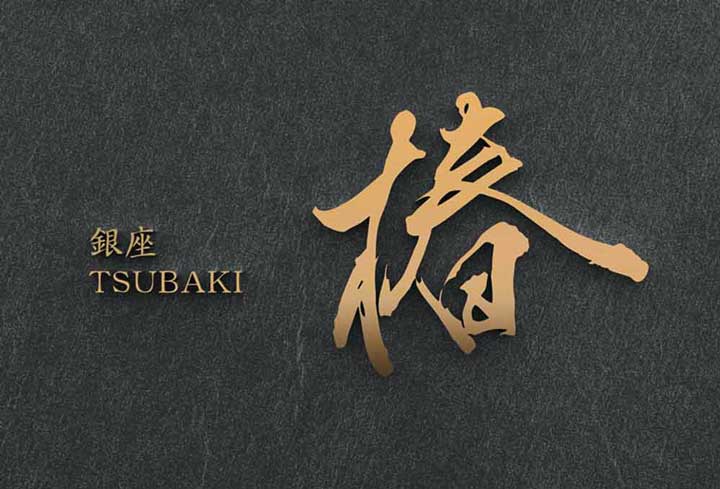
11:Luxury Japanese Logo│Club『TSUBAKI』
“TSUBAKI 椿” means camellia, a plant.
In Japan, this name is often used to describe women.
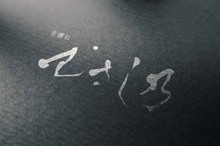
12:Luxury Japanese Logo│Restaurant『MUSASHINO』
“MUSASHINO むさし乃” is a name derived from a Japanese place name.
A logo design featuring beautiful undulating hiragana characters.
Other reference designs
About Us
SANTEN Design is a company specializing in the production of brush lettering logos.
We specialize in the creation of flexible brush lettering logos to suit a variety of uses and requests.
We will be happy to provide you with quotations, consultations on various types of production,
and of course, detailed information on our achievements.
Please feel free to contact us for a quotation.

