Brushstroke logos are used in many ramen restaurant logos.
This is one of the reasons why the adoption rate is so high, as the expressive brush stroke design is ideal for creating signs and logos that require visibility and uniqueness.
In this section, we would like to introduce some of the ramen restaurant logo designs we have created in the past.
We hope you will find them useful for your future productions.
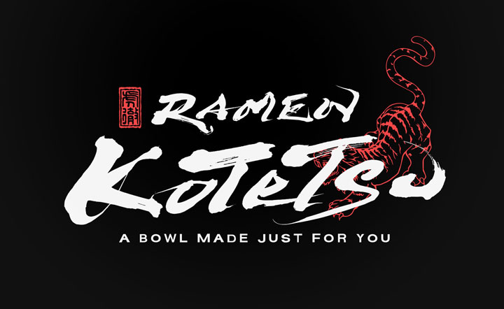
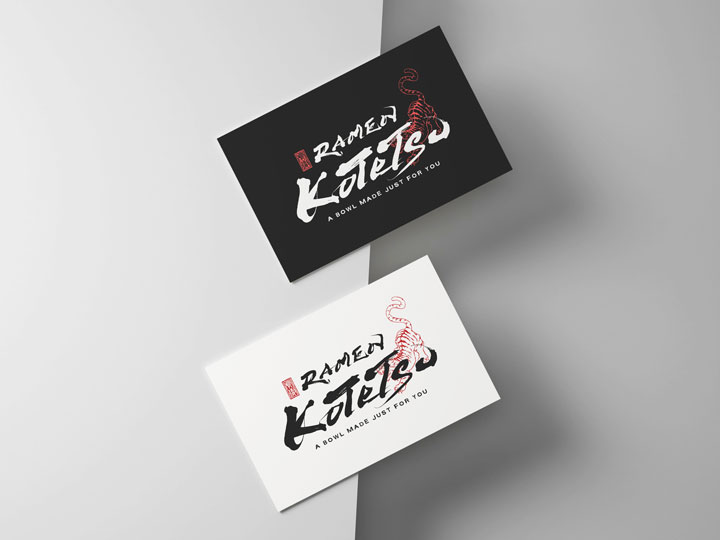
『Ramen Kotetsu』Logo Design
The name “虎徹” (Kotetsu) is inspired by the famous Japanese sword “Kotetsu,” which is a traditional craftwork that Japan is proud of globally.
The message embedded in this logo is the inheritance of the spirit of this renowned sword, conveying the dedication of utmost skill and heart in every bowl of ramen served.
Ramen Noodle Shop Logo Design – Kotetsu
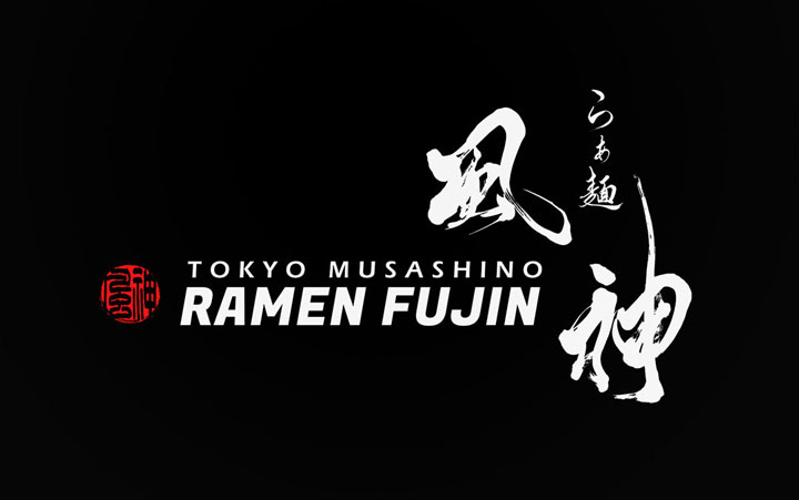
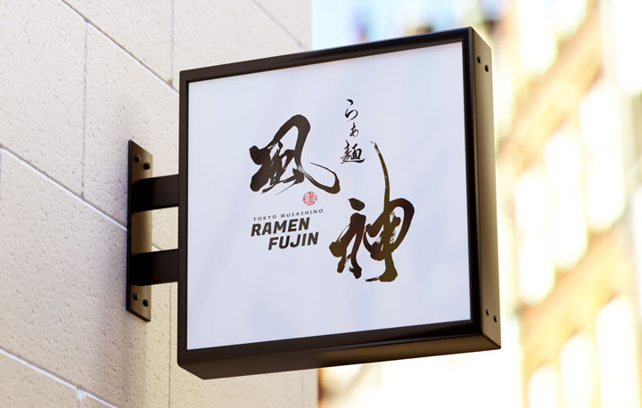
『Ramen Fujin』Logo Design
Inspired by the word “Fujin 風神”, the entire logo has movement that makes the characters themselves appear like wind.
By combining calligraphy with Gothic fonts, we aimed for a harmony of tradition and modernity.
Overall, it gives a simple yet powerful impression, emphasizing visual impact.
Authentic Ramen Logo Design – Fujin
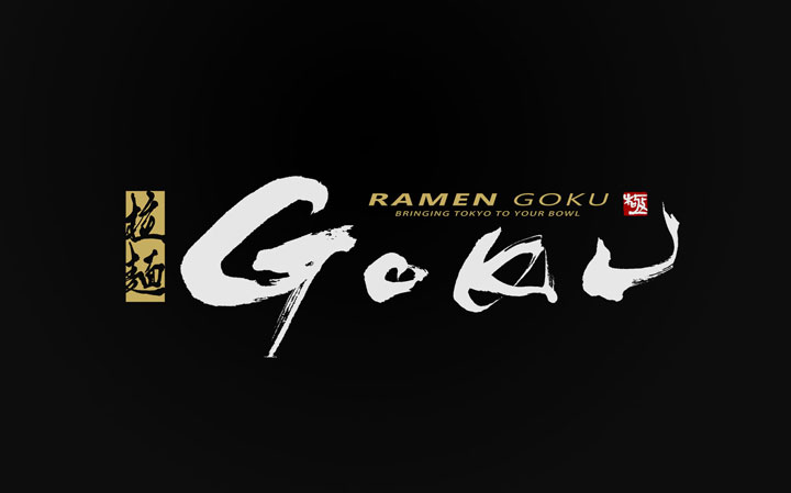
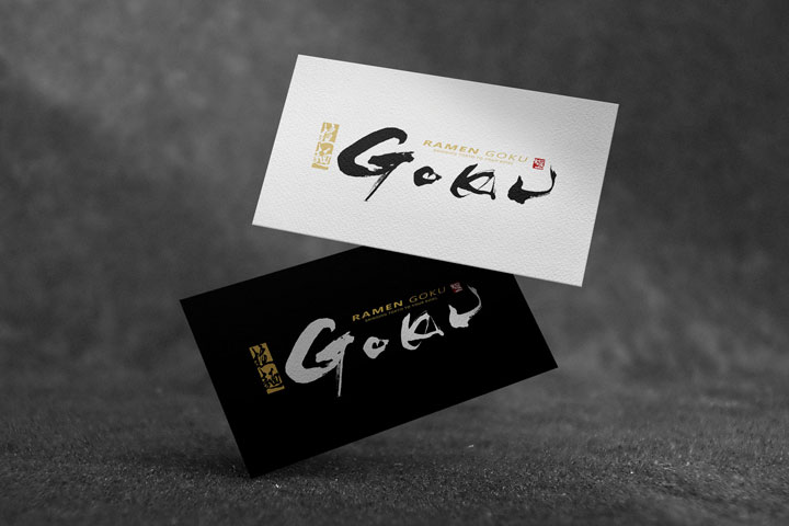
『Ramen Goku』Logo Design
The logo for “GOKU” is designed with the concept of a fusion between the dynamism of Tokyo and the culture of ramen.
It aims to express the balance between the fast pace of the city and the meticulousness of traditional cuisine within the logo.
Japanese Ramen Shop Logo – Goku
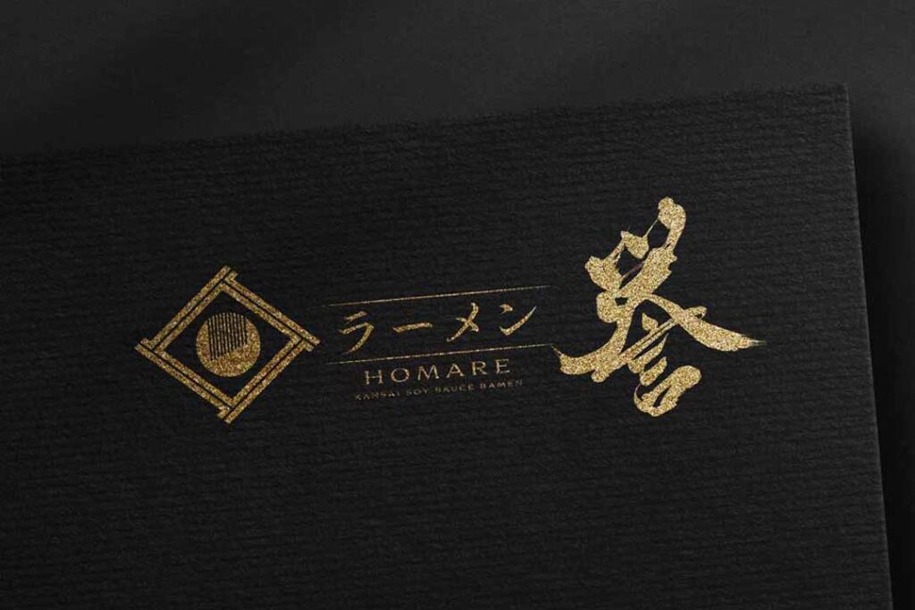
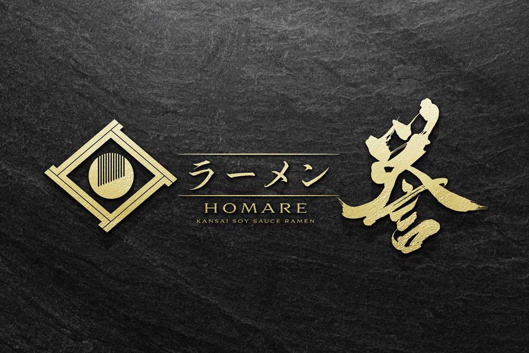
Ramen Logo Design│『HOMARE』
Introducing the logo design for the ramen restaurant HOMARE combined with the family crest logo.
The brush strokes of “HOMARE 誉” are boldly written to give a sturdy impression.
It is composed of brush strokes and family crests flanked by ramen characters.
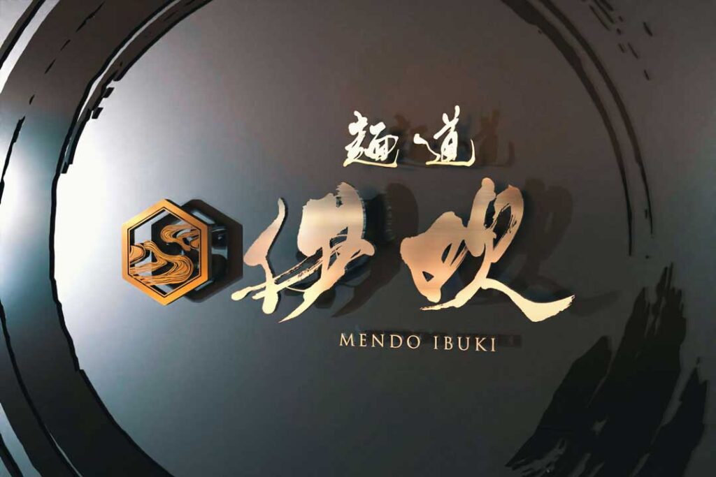
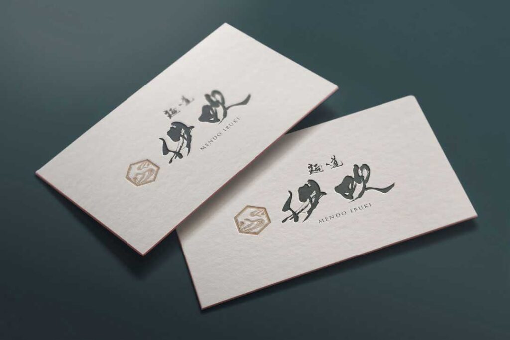
Ramen Logo Design│『IBUKI』
We created flowing brushstrokes that match the powerful and vigorous ramen shop.
In order to express a sense of dynamism, the letters are blurred and the letters are thicker and weaker.
The logo design features a pattern representing ramen noodles in a traditional hexagonal grid.
Ramen Logo Design for Mendou Ibuki
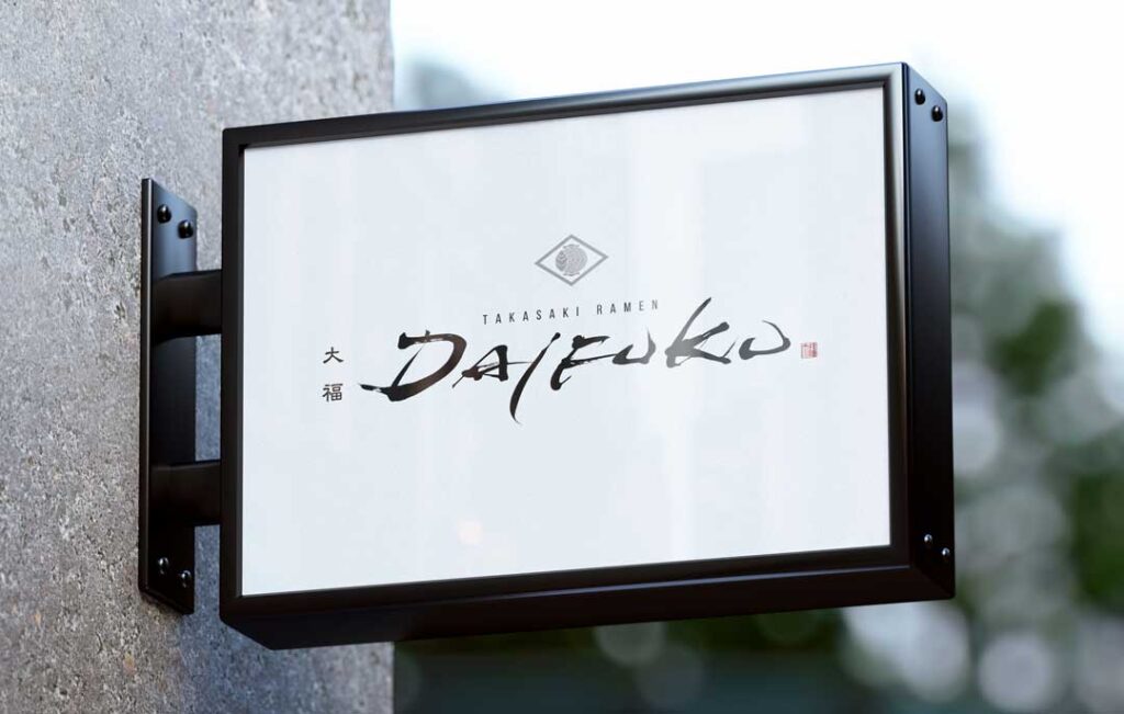
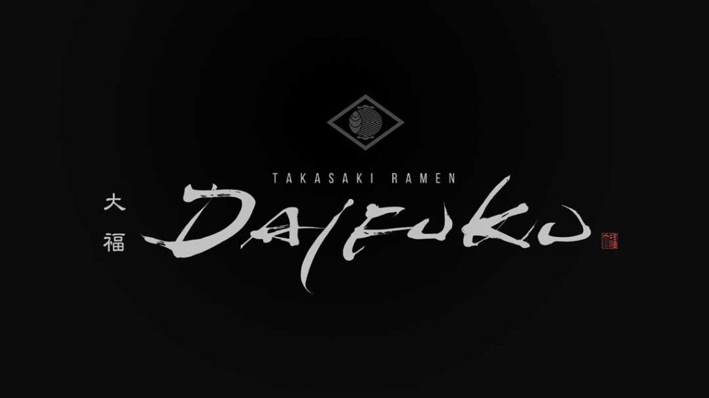
Ramen Logo Design│『DAIFUKU』
Introducing a logo design for a unique ramen restaurant with alphabets written in brush strokes.
By incorporating digital fonts into the Japanese design, the logo has a modern look and feel.
The alphabetic store name is also placed in brush strokes for easy visibility.
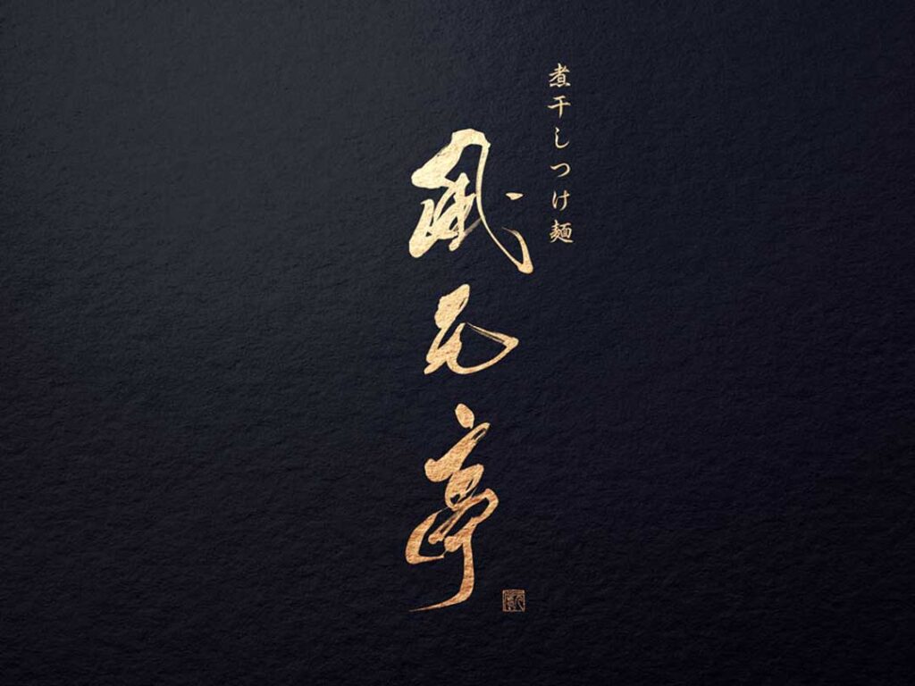
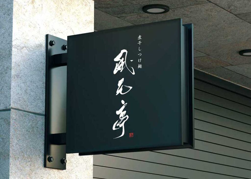
Ramen Tsukemen Logo Design│『FUGENTEI』
The logo design is for a tsukemen and ramen restaurant with a slightly vigorous and blurred traditional typeface.
The design is a simple and enduring combination of brush strokes and seal engraving design.
Logo Design for Tsukemen Fuugentei
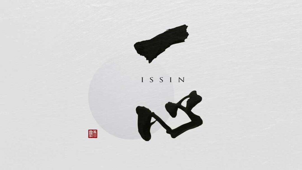
Ramen Logo Design│『ISSIN』
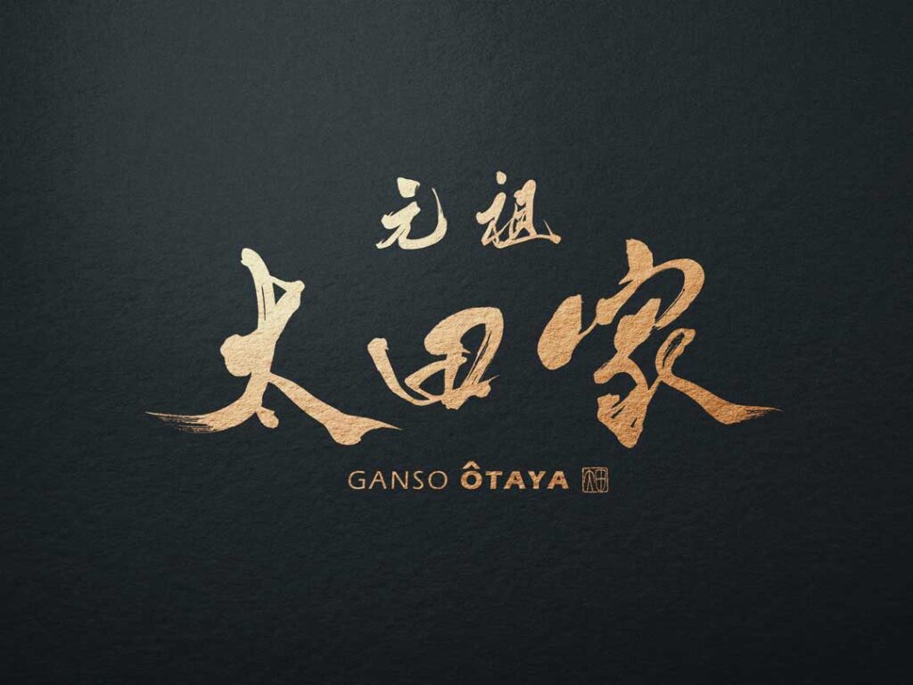
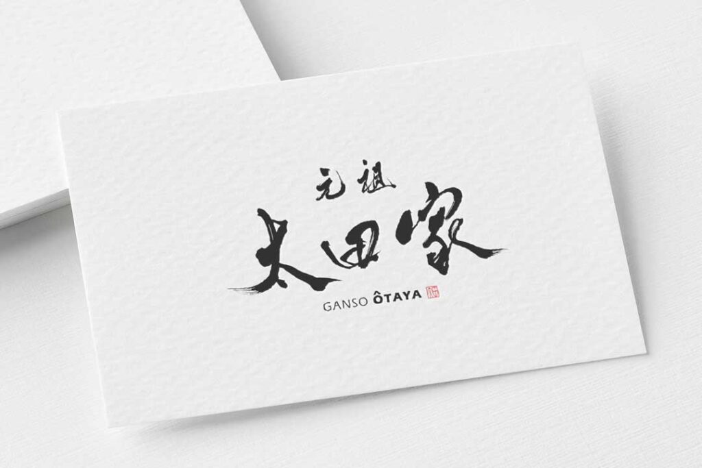
Ramen Logo Design│『OTAYA』
We created bold, vigorous brushstroke letters that match the ramen restaurant.
There are no fancy decorations, but the logo design is easy to read and never gets boring.
The design of the seal seal uses the old character style of “Ota” and a square seal is attached to the logo.
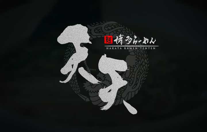
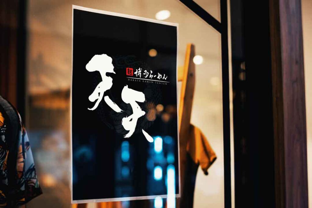
Ramen Logo Design│『TENTEN』
The logo design uses the same Japanese Kanji characters, but the first and second letters are different from each other to express the characters more richly.
The seal engraving seal is designed in the motif of the old Japanese character 麺 noodle”.
The layout of the brush strokes and seal impressions is designed to fit in the same size horizontally and vertically.
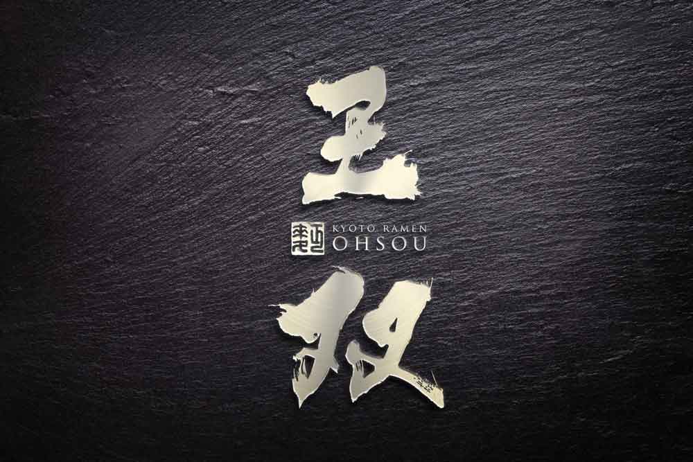
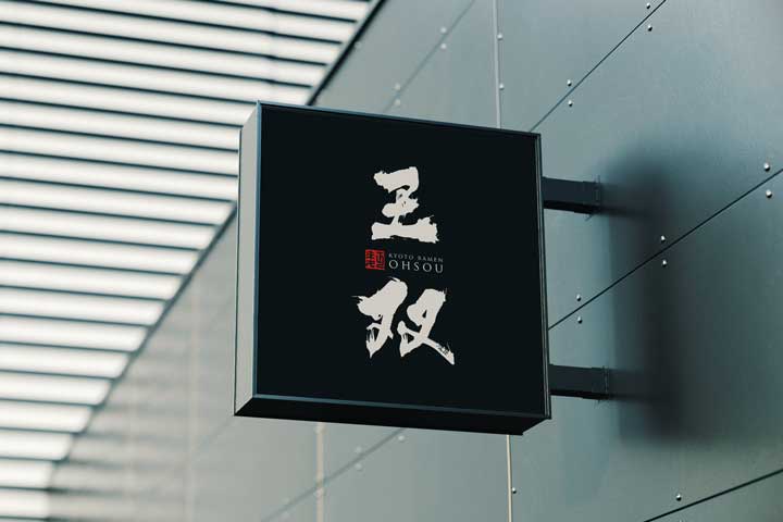
Ramen Logo Design│『OHSOU』
The font is created with thick, solid, and powerful handwriting suitable for the company name “Ouso”.
The design incorporates splashes and blurs, but does not compromise readability.
This is an example of a ramen restaurant logo design that combines brush strokes, alphabets, and a seal-engraving seal.
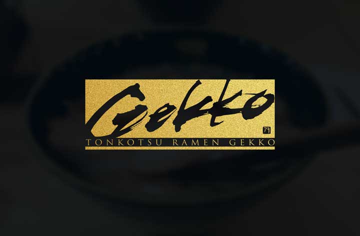
Ramen Logo Design│『GEKKO』
This is a unique logo design for a ramen restaurant that was created using alphabets instead of kanji or hiragana.
The shape of the logo is not confined to a traditional logo, but still gives a sense of Japanese design.
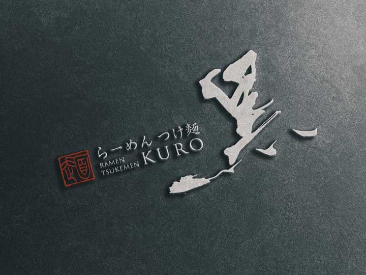
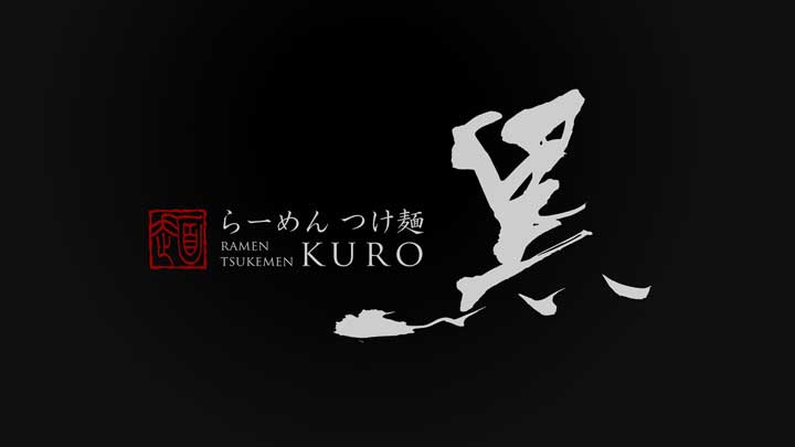
Ramen Tsukemen Logo Design│『KURO』
In order to express momentum and strength, the brush strokes are slightly raised to the right,
and the dots are wider to give the letters a sense of stability and to prevent the logo design from spreading too far when combined with the digital font.
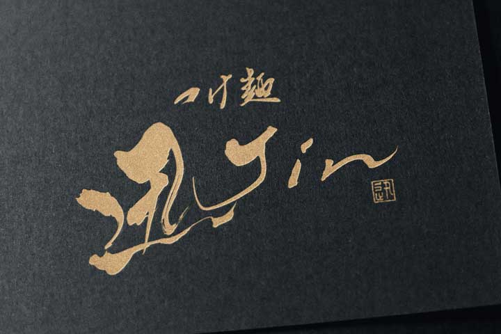
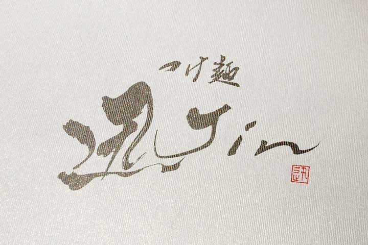
Ramen Tsukemen Logo Design│『JIN』
The logo design for “Jin” embodies the world of tsukemen by combining two elements: the “swiftness of the moment” and the “pursuit of lasting flavor.”
It preserves the traditional beauty of brush calligraphy while being refined to suit modern sensibilities.
Ramen Logo Design│『KATSUYAMA』
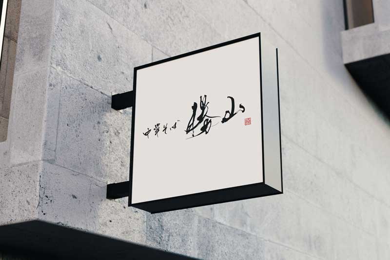
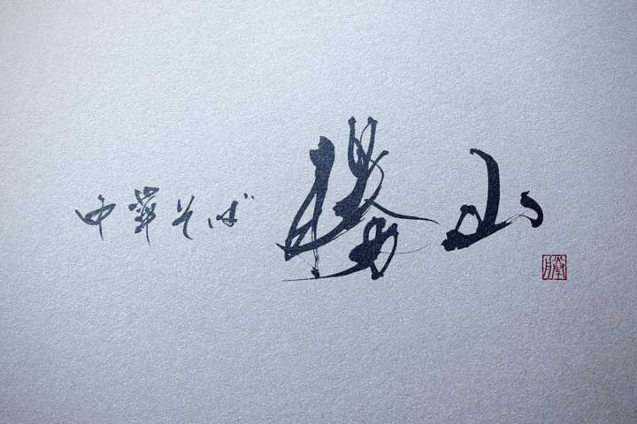
This is a simple brush stroke design with orthodox brush strokes without too much decoration.
The brushstrokes express the lively movement of the noodles without compromising readability.
For the seal design, we used the old “Katsu” script and added a square seal to the logo.
The logo design is well-balanced and harmonious with both the brush strokes and the seal impressions.
Logo Design for Ramen Katsuyama
Summary
Did you feel the charm of ramen shop logo designs through this article?
Each shop’s carefully crafted design reflects the taste and atmosphere of the shop.
By cherishing traditional elements while incorporating modern sensibilities, a unique logo is born.
Simple yet memorable designs stick in the customers’ minds, making them want to visit again.
We hope this article provides some helpful hints for finding the perfect logo design for your shop.
Recommended Related Articles
About Us
SANTEN Design is a company specializing in the production of brush lettering logos.
We specialize in the creation of flexible brush lettering logos to suit a variety of uses and requests.
We will be happy to provide you with quotations, consultations on various types of production,
and of course, detailed information on our achievements.
Please feel free to contact us for a quotation.

