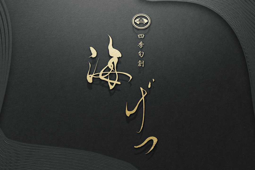
‘Shikishunso Kaigetsu’ embraces the flavors of Japanese cuisine that accompany daily life and the beauty of nature woven by the four seasons, expressed through its dishes.
We are proud to introduce a logo that embodies the philosophy of such a restaurant.
Concept
The logo encapsulates our aspiration to ‘use seasonal ingredients to create cuisine that evokes the seasons.’
By employing traditional Japanese calligraphy, we aimed to design a logo that conveys the essence and dignity of Japanese cuisine.
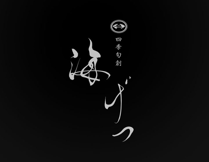
About the Calligraphy
The spirit of a Japanese restaurant that cherishes the changing seasons and seasonal ingredients is expressed through the delicacy and strength of calligraphy.
Calligraphy is a symbol of Japanese culture; its flowing curves and the powerful yet delicate strokes represent the transition of the seasons through meals and our sincere approach to cooking.
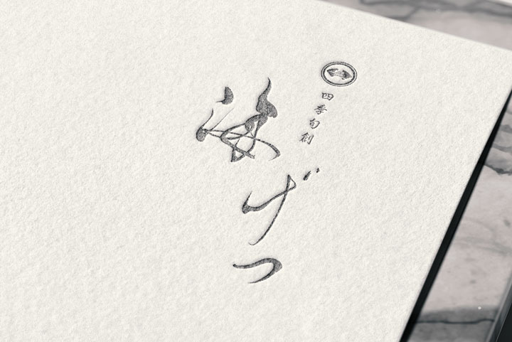
Logo Design Details
Care has been taken to ensure a design that is simple yet has a presence.
Special attention has been given to the thickness of the characters and spacing, achieving both readability and visual appeal.
The space surrounding the logo is also considered important, balancing it with the characters to enhance the sense of luxury even further.
Conclusion
This logo for ‘Shikishunso Kaigetsu’ combines respect for tradition with a touch of modernity.
We have strived to reflect the high quality of the Japanese restaurant and the seasonal ambiance.
We hope that this logo will continue to be cherished as the face of the establishment by many.”

