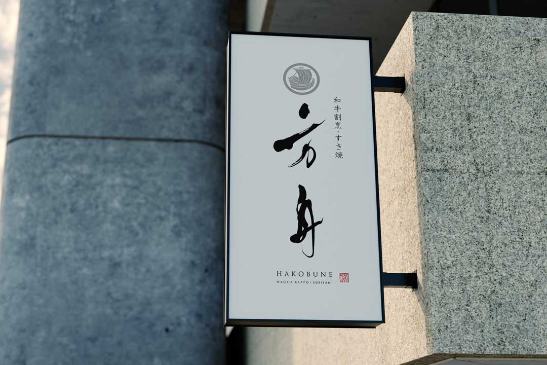
I would like to introduce the logo design for a Japanese restaurant named “Wagyu Kappo Hakobune(Ark)“
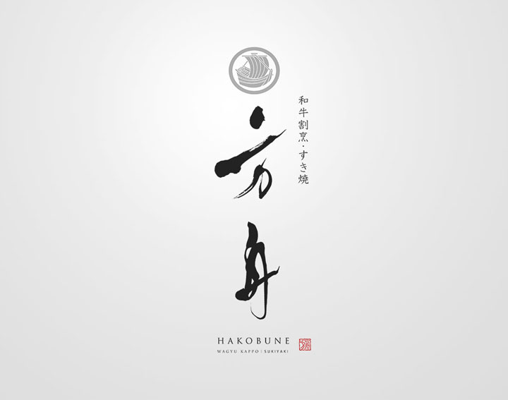
This logo aims to express the essence and serene beauty of Japanese cuisine using traditional brush calligraphy.
Concept
The logo for “Wagyu Kappo Hakobune(Ark)” symbolizes the combination of traditional Japanese kappo cuisine and high-quality Wagyu beef.
The ark, or “box boat,” represents a vessel carrying select ingredients across the sea of flavors, inviting customers on a culinary journey through meticulously chosen Wagyu beef and its dishes.
About the Calligraphy
The brush calligraphy is drawn using the techniques of traditional Japanese calligraphy.
The strokes, both strong and delicate, represent the rich taste of Wagyu beef and the craftsmanship of those who prepare it.
Additionally, the flowing curves of the characters evoke the refined flow of kappo cuisine and the peaceful passage of time enjoyed while dining.
Conclusion
In creating the logo for “Wagyu Kappo Hakobune(Ark)”
I was able to reappreciate the strength and delicacy inherent in brush calligraphy.
I aim to continue pursuing designs that harmonize traditional Japanese elements with modern sensibilities.
I hope this logo serves as a gateway to new attractions in the world of Japanese cuisine. Thank you for

