Today, we are excited to introduce the new logo design for Seishikai Karate Dojo.
This logo skillfully combines traditional Japanese aesthetics with modern design elements, embodying the spirit of the dojo.
Concept of the Logo Design
The new logo of Seishikai Karate Dojo aims to visually represent the dojo’s philosophy and spirit.
While respecting Japanese traditions, it pursues a design that combines strength and elegance.
This logo embodies the pride and conviction of the dojo.
About the Calligraphy
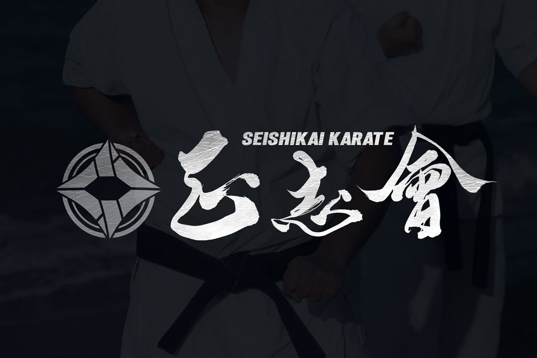
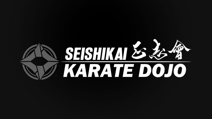
The central feature of the logo is the brush strokes, which beautifully and powerfully represent the traditional Japanese calligraphy.
The flowing movements and strong lines of the brush symbolize the spirit of the dojo and the beauty of karate techniques.
The brush strokes leave a deep impression on the viewer and strongly convey the values of the dojo.
Logo Design Details
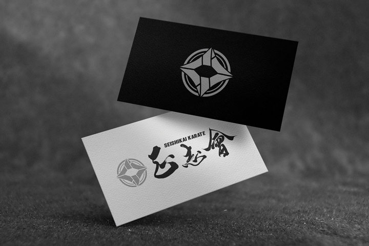
On the left side of the logo is the emblem symbolizing the dojo.
This emblem represents the values and traditions of the dojo, providing consistency to the overall design.
On the right side, the powerful brush strokes spell out “正志会” (Seishikai), with the simple yet impactful English text “SEISHIKAI KARATE” placed above it.
This balance between Japanese and English makes the design approachable for both domestic and international students and visitors.
Conclusion
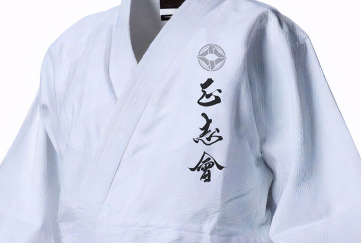
The logo design for Seishikai Karate Dojo splendidly expresses the beauty of Japanese tradition and the strength of karate.
We hope this logo symbolizes the dojo’s philosophy and conveys the dojo’s charm and pride to many people.

