Japanese Omakase Restaurant Logo Design │ ShinoBi
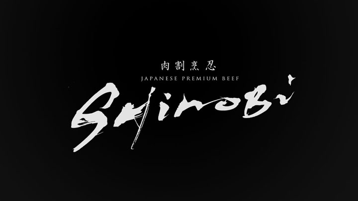
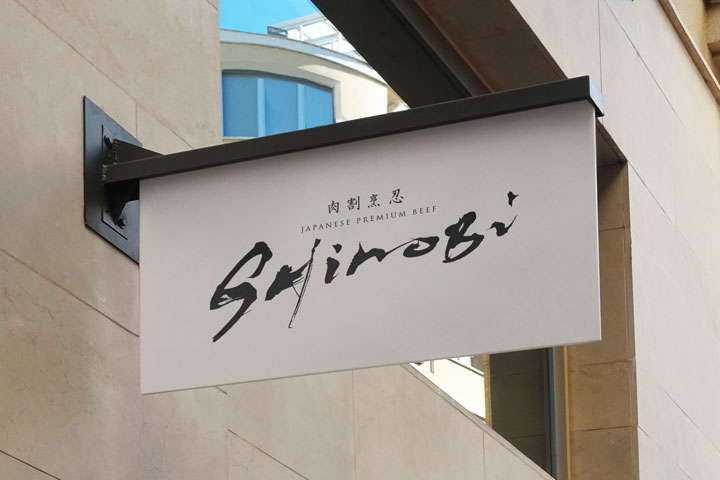
“Niku Kappou Shinobi” is a serene hideaway that serves premium quality meat dishes.
The logo symbolizes the quietude and the excellence of our cuisine.
It represents a place where the robustness of the meat dishes and the tranquility of the dining experience coexist.
Logo Design For Japanese Restaurant Shinobi
Japanese restaurant Logo Design │ Kagetsuan
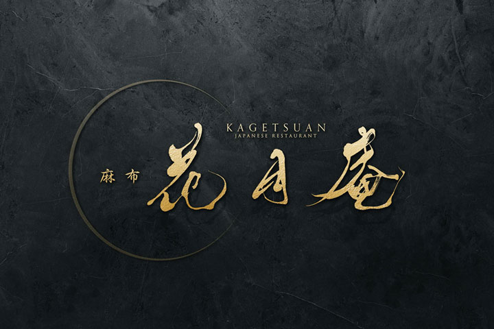
The concept of our logo design is “the tranquil resonance of Wa (Japanese harmony).”
The classic beauty of the calligraphy and the calm atmosphere it creates are in harmony with the rich flavors of the cuisine.
Japanese Restaurant Logo – Azabu Kagetsuan

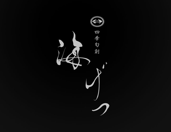
Japanese restaurant Logo Design │ Kaigetsu
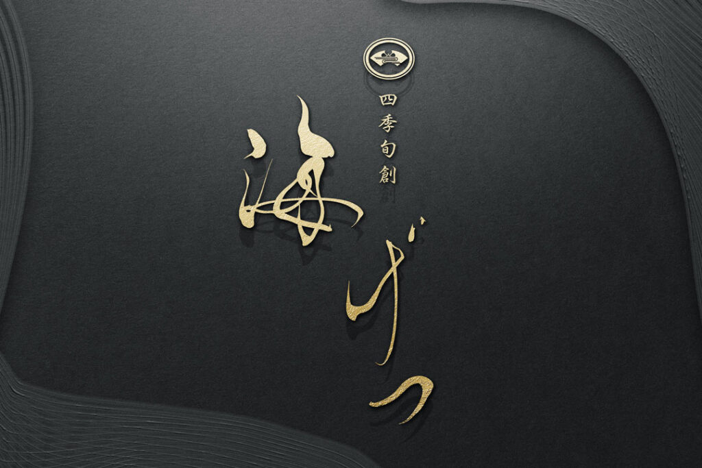
Care has been taken to ensure a design that is simple yet has a presence.
Special attention has been given to the thickness of the characters and spacing, achieving both readability and visual appeal.
The space surrounding the logo is also considered important, balancing it with the characters to enhance the sense of luxury even further.
Japanese Restaurant Logo Design – Kaigetsu
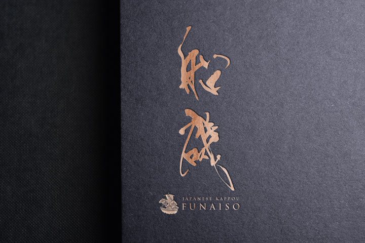
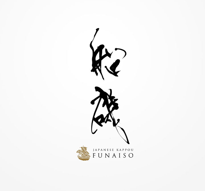
Japanese Omakase Style Restaurant Logo Design │Funaiso
The brush lettering was chosen to strongly express the identity of the Japanese restaurant.
Calligraphy plays an important role in Japanese culture, and the powerful movement of the brush symbolizes the passion in the cuisine and the skill of the craftsmen.
The characters used in this logo represent the name of the Japanese restaurant, “Funaiso,” and the style of the script incorporates both traditional and modern sensibilities.
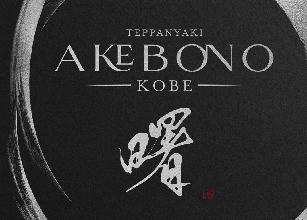
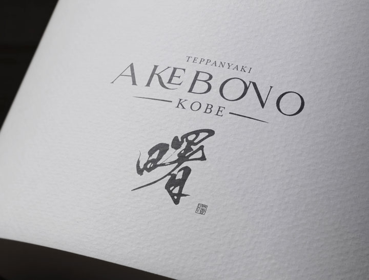
Omakase Style Teppanyaki Restaurant Logo Design │Akebono
While maintaining a modern yet classical beauty, the logo is designed for readability.
‘TEPPANYAKI’ is placed on the upper left and ‘KOBE’ on the lower right, incorporating English to convey the name and location to both domestic and international guests.
The design is kept simple overall, focusing on the beauty of the characters themselves.
Teppanyaki Logo Design – Akebono

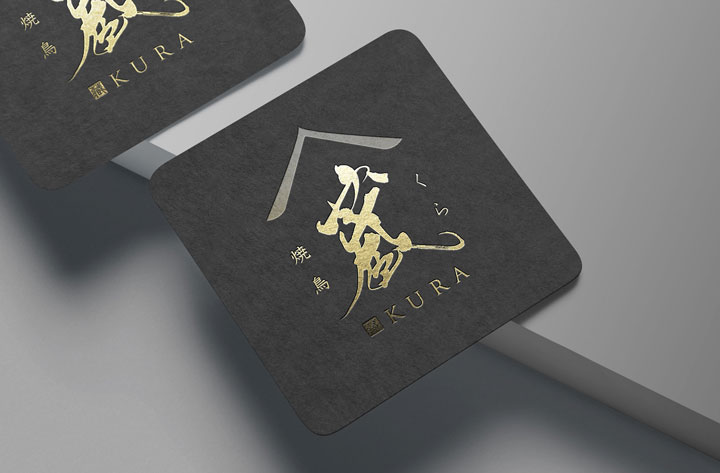
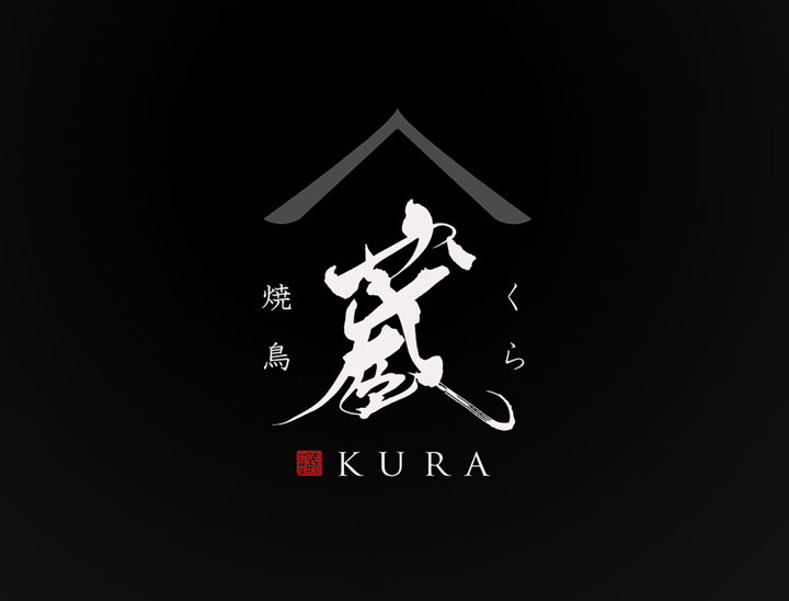
Omakase Style Yakitori Restaurant Logo Design │Kura
The concept behind the “Yakitori Kura” logo is to preserve the good old Japanese atmosphere while infusing a contemporary air.
We aimed for a design that combines the warmth of an old folk house with the sophistication of modern architecture.
Omakase Sushi Restaurant Logo Design │Narumi
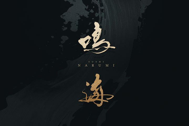
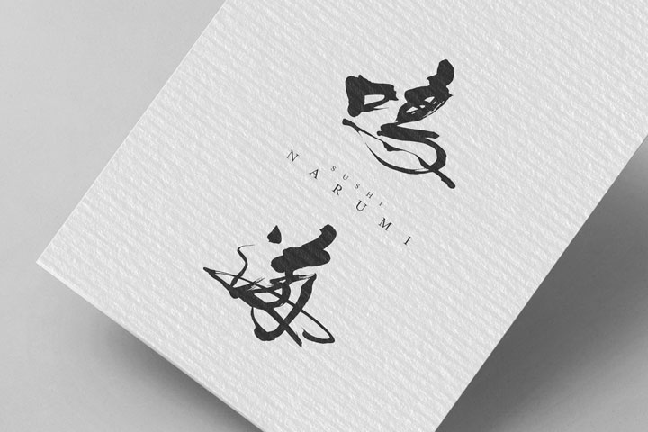
The logo design for “Narumi” embodies the chic and delicate beauty of sushi, along with the strong spirit that supports it.
The calligraphy was chosen to symbolize this spirituality and to represent the harmony of elements found in sushi—stillness and motion, softness and strength.
Authentic Sushi Restaurant Logo Design – Narumi
Conclusion
Omakase-style fine dining restaurants offer a unique experience with their distinct aesthetics and craftsmanship.
Logo design is an integral part of this, combining simplicity with deep meaning.
A logo that blends tradition and modernity while highlighting the restaurant’s individuality conveys its charm to visitors.
As designers, we are committed to supporting this special style and constantly embracing new challenges.
We aim to continue evolving the logo design for omakase-style restaurants, sharing its allure with a wider audience.

