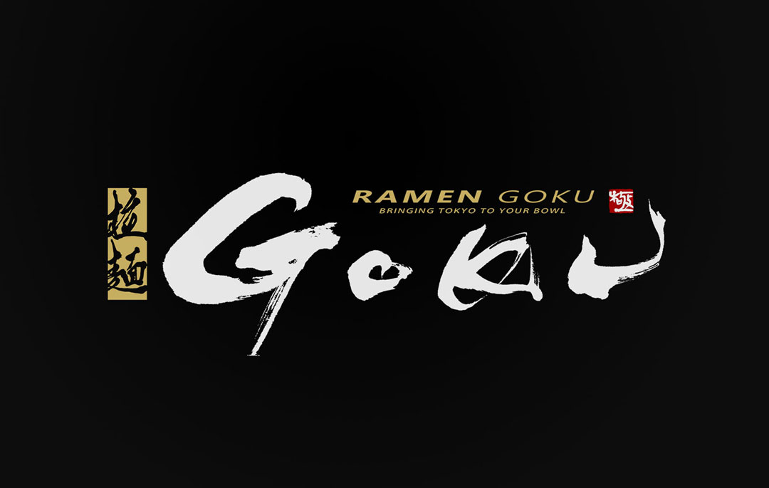
Today, we introduce the “GOKU” logo design. It embodies the charm of traditional calligraphy while proposing a new way to enjoy ramen, making it a contemporary logo with a nod to tradition.
Concept
The logo for “GOKU” is designed with the concept of a fusion between the dynamism of Tokyo and the culture of ramen.
It aims to express the balance between the fast pace of the city and the meticulousness of traditional cuisine within the logo.
About the Calligraphy
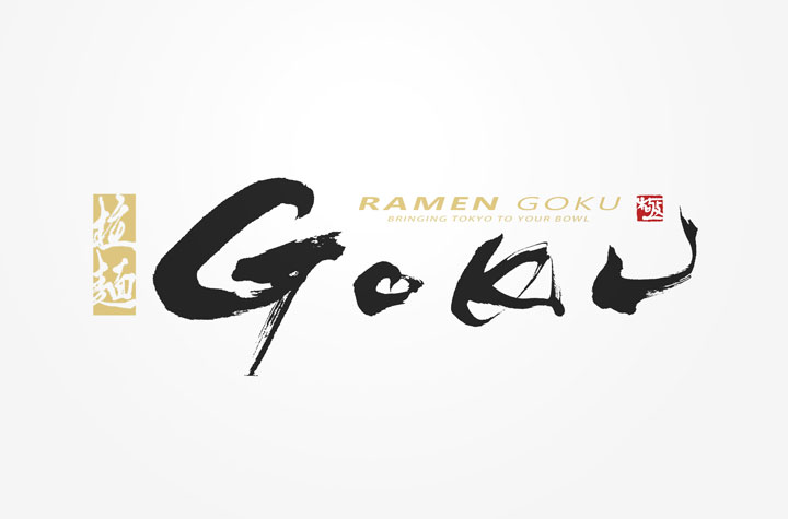
The brush calligraphy, while in the form of the Latin alphabet, resonates with the grace of traditional Japanese calligraphy.
The font design, which harbors both vigor and delicacy, is a deliberate effort to let international customers experience the unique beauty inherent to Japanese calligraphy.
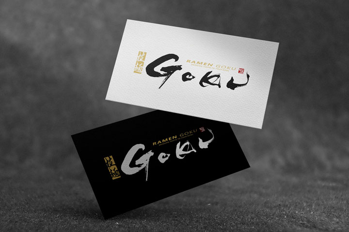
Logo Design Details
The robust lettering of “GOKU” creates a dynamic shape that delivers a visual impact.
Additionally, the red seal stamp adds depth to the logo, crafting a memorable visual presence.
Enclosed within the seal is the character “極,” which brings an added visual effect and emphasizes the logo’s appeal.
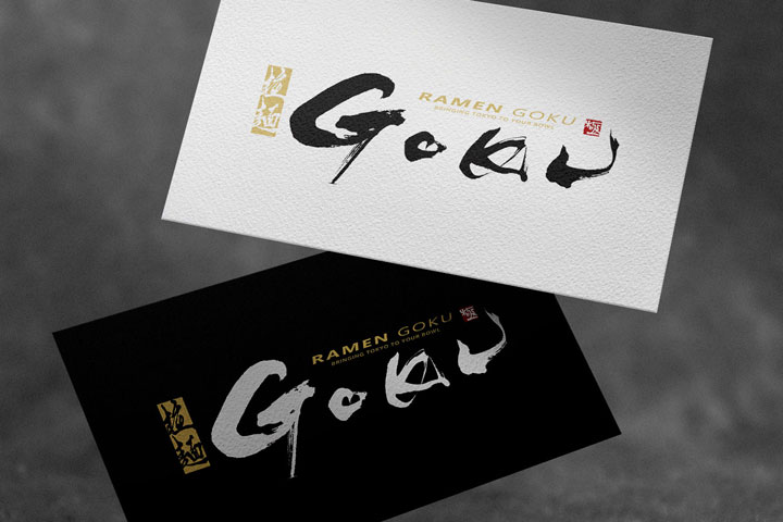
Conclusion
The “GOKU” logo we have created harmonizes the beauty of traditional calligraphy with modern simplicity, strongly conveying the identity of the ramen shop.
We hope that this logo serves as a bridge for communication through food and becomes a memorable symbol for many.

