This time, I’d like to talk about the redesign of the “Chuka Soba(Ramen) Katsuyama” logo.
We’ve taken a simple approach to stepping into the new while cherishing tradition, and I’d like to show you how we’ve shaped this concept.
Concept
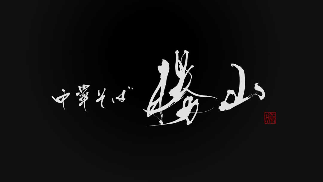
This logo represents the ethos of “Chuka Soba(Ramen) Katsuyama,” which maintains the taste of the good old days while continuing to evolve with the new era.
We chose to use traditional brush lettering to aim for the creation of a brand image that is loved across generations.
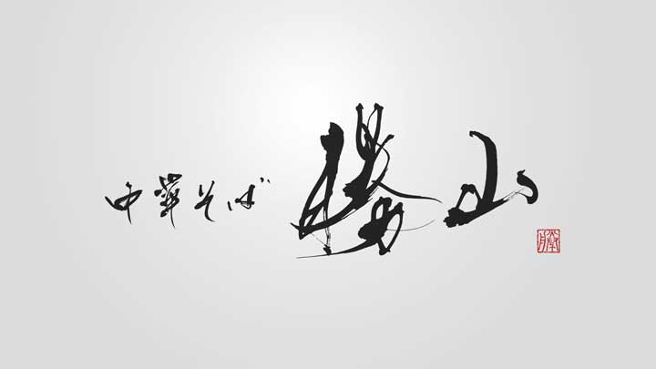
About the Calligraphy
The brush lettering used in this logo is drawn with lines that are strong yet convey a sense of warmth.
This lettering, rooted in Japanese traditional culture, was designed with special care to evoke the flavor of the noodles and the history of the shop.
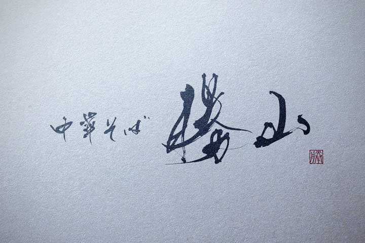
Logo Design Details
The logo exudes a timeless elegance that is simple yet makes the brush lettering stand out.
The red seal stamp serves as an accent that enhances uniqueness and recognizability.
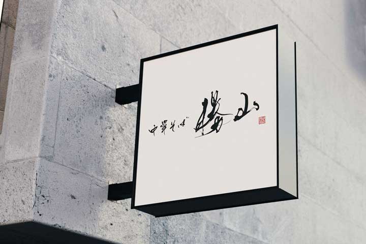
Conclusion
In creating the logo for “Chuka Soba(Ramen) Katsuyama,” I hoped to convey to our customers the spirit of the shop, which treasures tradition while continually evolving.
I wish for this logo to aid in carving out a new history of food.

