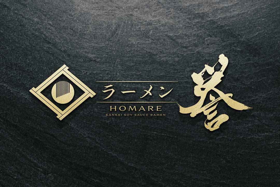
“Ramen Homare” is a ramen restaurant that conveys traditional Japanese flavors to the modern era.
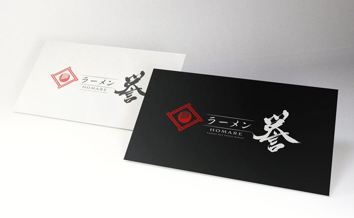
The emblematic logo of the restaurant incorporates elements that evoke the tradition and dignity of Japan.
Concept
The concept of this logo was born from the idea of “innovation within tradition.
” For a restaurant serving Kansai-style soy sauce ramen, we aimed to incorporate elements that evoke Japanese traditional culture while pursuing a contemporary simplicity.
About the Calligraphy
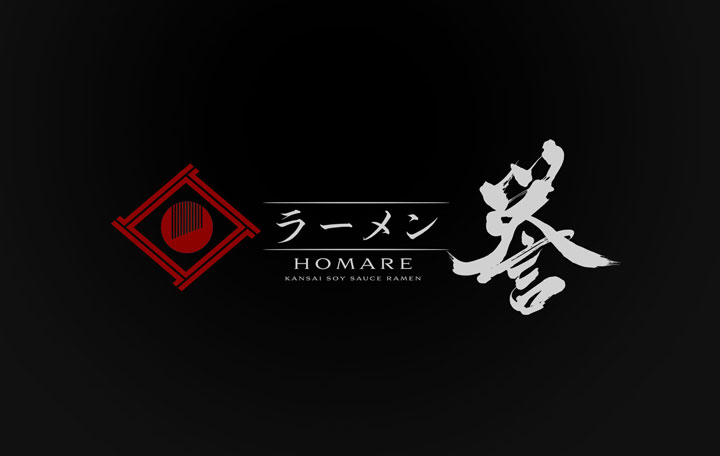
The brush script used is characterized by its flowing brushwork, embodying both strength and elegance.
It symbolizes the artisan’s spirit and meticulous attention to detail that goes into every bowl of ramen.
Logo Design Details
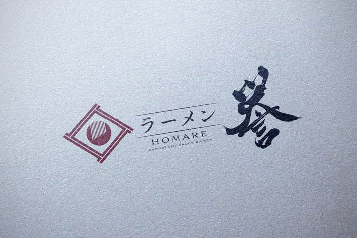
At the heart of the logo, the family crest-inspired design creates a striking contrast, achieving a memorable visual.
The combination with the brush script enhances its sophistication.
The typography in English adds a modern impression, appealing to an international clientele.
Conclusion
The “Ramen Homare” logo aims to create a brand image that is loved by customers both in Japan and internationally, by fusing traditional Japanese brush script with a family crest-like design.
We hope that this logo, simple yet with a deep story, instantly recognizable as “Japanese Ramen,” will become a beloved face of the ramen restaurant to many people.
Other Introduction

