Today, I would like to share with you the concept, inspiration, and creative process behind the logo design of the ramen shop “Kuro”.
Concept
“Kuro” symbolizes profound taste, limitless potential, and infinite tranquility.
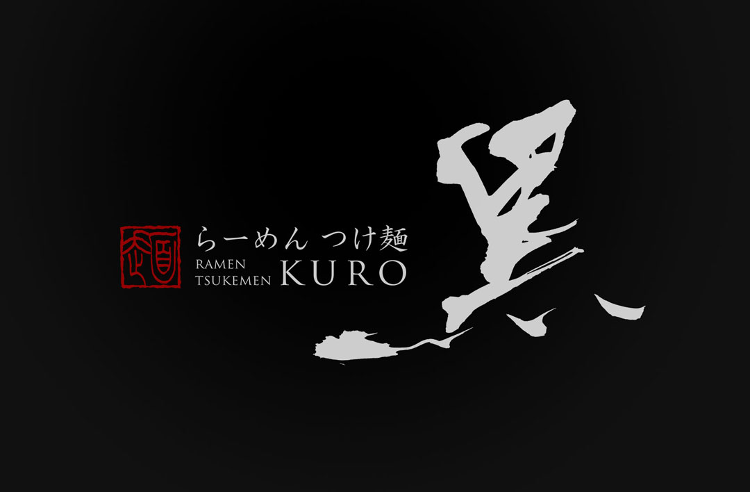
In designing the logo for the ramen shop “Kuro”, I aimed to express the significance of this color through the strength and delicacy of brush writing.
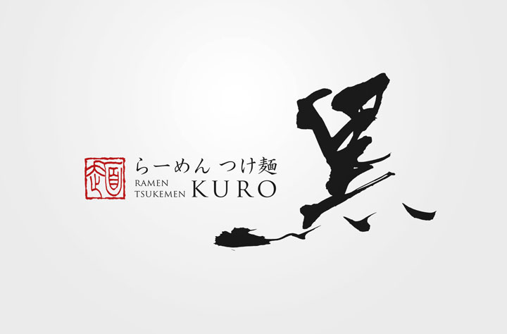
This logo is intended to be a medium that conveys the shop’s philosophy and promise to customers – a promise of passion in each bowl of ramen and its deep flavor.
About the Calligraphy
The brush writing used in the “Ramen Kuro” logo was carefully selected to tell a story with each stroke and convey deep emotions.
The thickness, momentum, and texture of the ink in the brush writing symbolize the deep flavor of the ramen and the solid philosophy of the shop that offers it.

Logo Design Details
The logo features a red seal positioned in the top left, with the modestly placed word “ramen” beneath it, expressing respect for tradition.
The central brush writing of “Kuro”, with its bold brush strokes, symbolizes the presence of flavorful ramen.
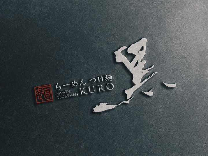
Below it, the splatters of ink evoke the vigorous slurp of eating ramen, adding an accent of movement and vitality.
Conclusion
I hope this logo design will leave a memorable impression on all who visit, and together with the flavorful bowl offered by Ramen Kuro, provide an experience that remains in the heart.

