Today, I would like to introduce a new logo design created for the soba restaurant “Soba Dokoro Jubei.”
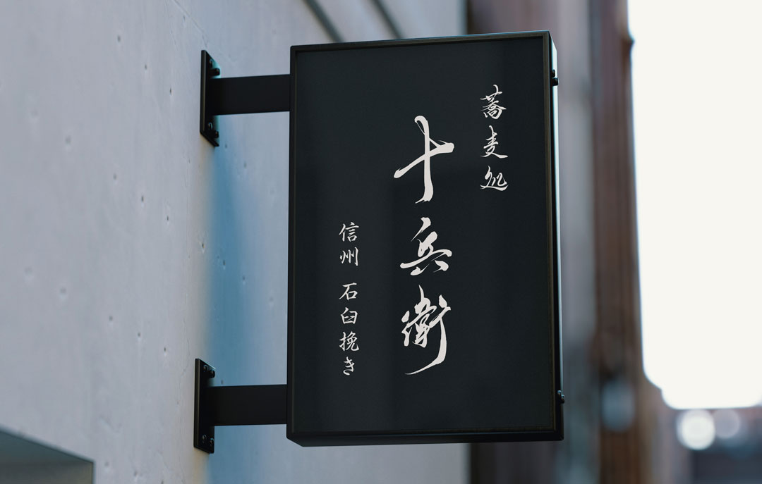
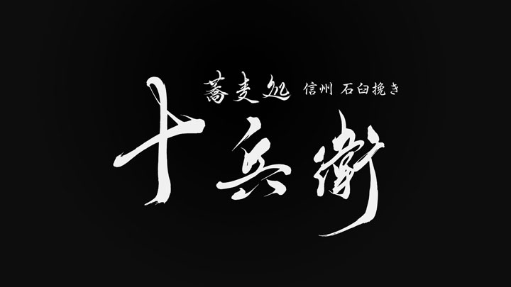
This logo uses traditional Japanese brush calligraphy to express the history and flavor of the soba restaurant.
Concept
Soba restaurant “Jubei” combines traditional soba-making techniques with modern aesthetics.
Therefore, the logo is designed to connect tradition and modernity, allowing visitors to instantly appreciate its value.
About the Calligraphy
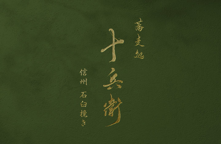
This calligraphy, which combines strength and elegance, symbolizes the flavor of the soba and the skill of the craftsmen.
The smooth lines and powerful expression of the brush calligraphy convey the high quality and tradition of soba restaurant “Jubei.”

Logo Design Details
In the center of the logo, “Jubei” is prominently displayed.
This emphasizes the name of the restaurant, leaving a deep impression on visitors.
Additionally, in the upper right corner, the smaller text “信州 石臼挽き Shinshu Stone-Milled” indicates that Shinshu-grown buckwheat flour is used and carefully milled with a stone mill.
Summary
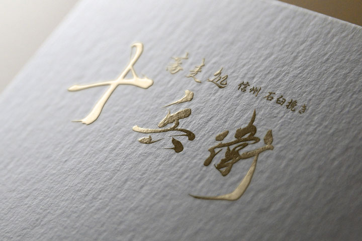
The logo of soba restaurant “Jubei” leverages traditional Japanese brush calligraphy to express the restaurant’s dedication and history.
Through this logo, we hope that visitors will feel the authentic taste of soba and the tradition of Japan.

