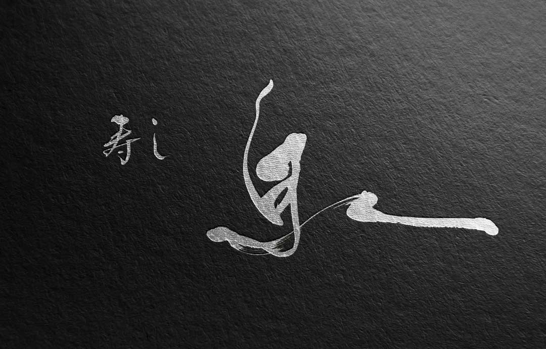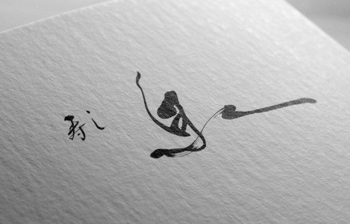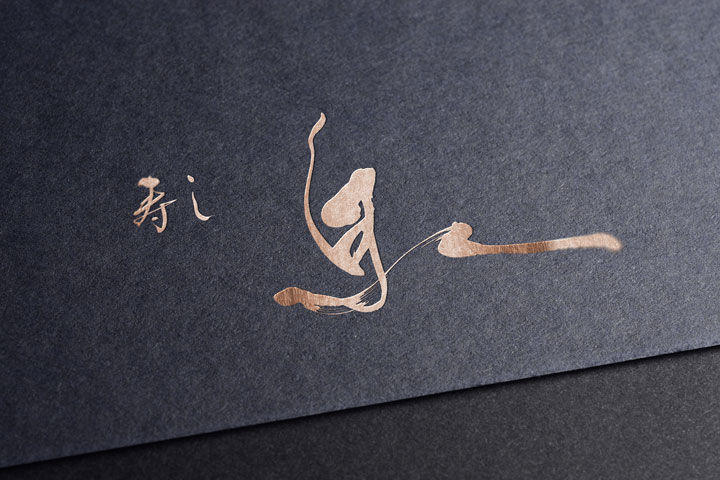
Our logo symbolizes what this sushi restaurant holds dear: freshness, purity, and deep respect for our customers.
In this blog, we will discuss the thoughts behind our calligraphy-style logo design and the process of its creation.
Concept
The logo design of “Sushi Izumi” aims to merge Japanese tradition with modernity.
Sushi, being an iconic part of Japanese food culture, demanded a representation of its refined beauty and delicacy in the logo.

The word “Izumi” signifies a source of clear, bubbling water, conveying an image of freshness and cleanliness to our customers.
This logo represents a return to the origins of food, while expressing the image of a sophisticated modern sushi restaurant.
About the Calligraphy
The calligraphy utilizes traditional Japanese calligraphy techniques.
Calligraphy is an art form where each stroke is imbued with the spirit of the artist, and this spirit was essential to our logo.

The flowing curves and powerful strokes are reminiscent of the movements of a sushi chef’s hands.
Furthermore, careful consideration was given to the balance and composition of the characters to achieve both visual beauty and readability.

Conclusion
Through the logo design of “Sushi Izumi,” we have shaped not just a visually striking image, but also the philosophy and soul of our restaurant.
We hope this logo allows our customers to feel the heart of our establishment with every piece of sushi they hold.
We will continue to pursue innovative designs while preserving tradition.


