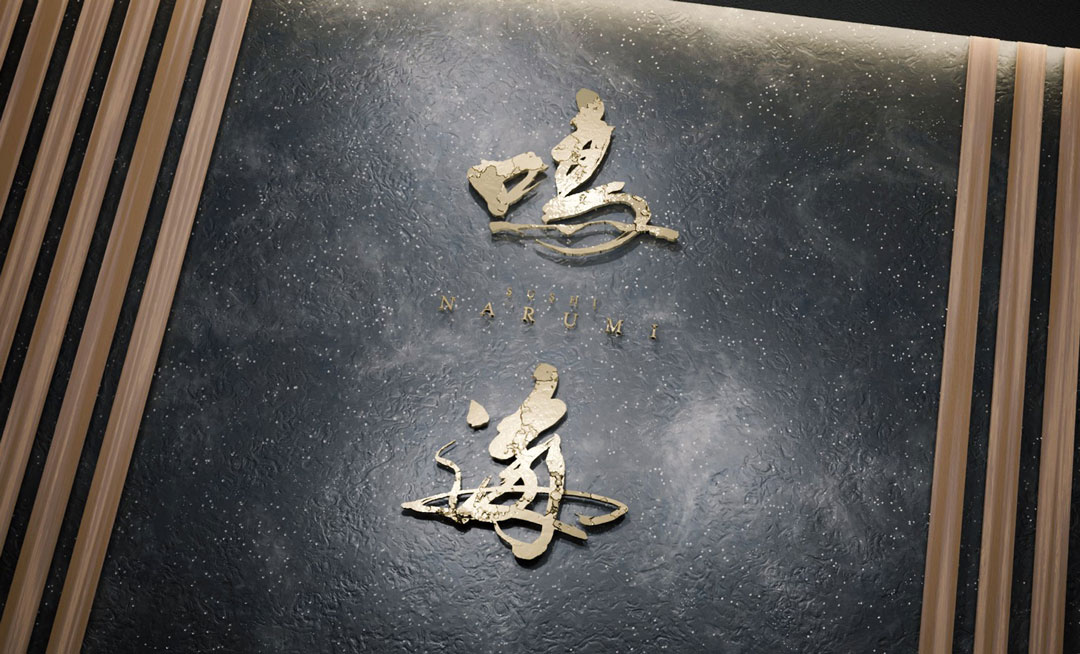
I have created a new logo for “Narumi”.
I would like to share the thoughts and concepts behind this simple yet impactful design.
Concept
The logo design for “Narumi” embodies the chic and delicate beauty of sushi, along with the strong spirit that supports it.
The calligraphy was chosen to symbolize this spirituality and to represent the harmony of elements found in sushi—stillness and motion, softness and strength.
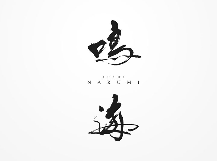
About the Calligraphy
The calligraphy mimics the movement of the sea, while also conveying the calmness of a serene ocean.
The brush strokes are simple yet dynamic, expressing the endless possibilities within the world of sushi.
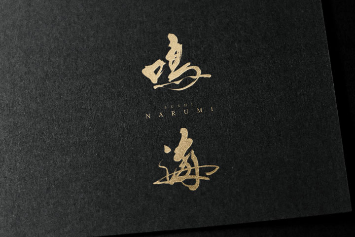
Logo Design Details
The logo pairs the calligraphic “Narumi” with its English notation “NARUMI”, influencing each other in their arrangement.
The calligraphy part expresses the strength and natural flow of traditional calligraphy, while the English part showcases modern simplicity and the choice of a refined font.
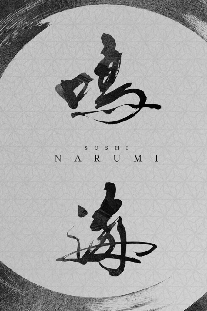
Conclusion
The “Narumi” logo is an attempt to convey the traditional beauty of calligraphy to the modern age, making it a suitable symbol for the new beginning of a sushi restaurant.
The warmth and strength of the calligraphy promise a comfortable space for guests, and its unique beauty is hoped to remain as a memorable aspect of the restaurant’s originality.

