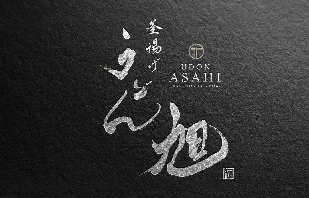
We have completed the logo design for the udon noodle specialty shop “Asahi.”
Here we briefly introduce the background and details of this design.
Concept
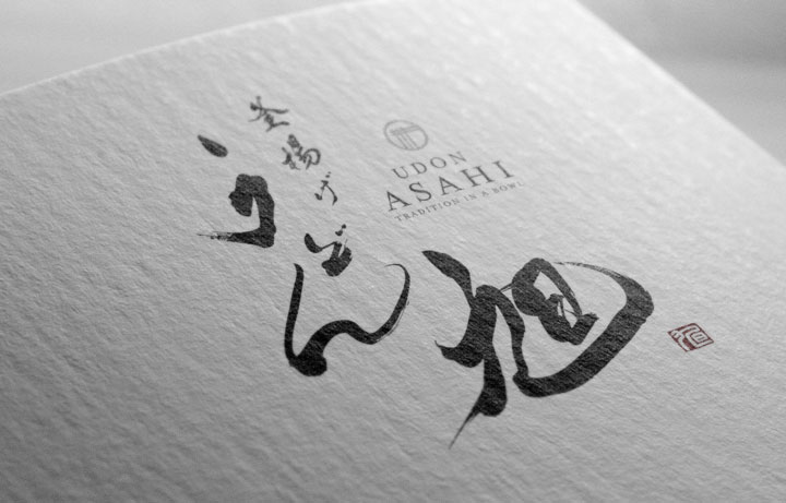
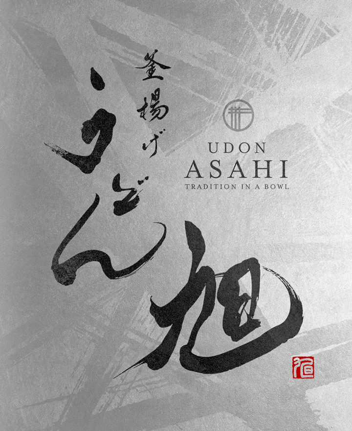
We aimed to create a universally appealing design by adopting traditional brush calligraphy and a family crest-style design, emphasizing the identity of a Japanese udon shop while incorporating a contemporary sense.
About the Calligraphy
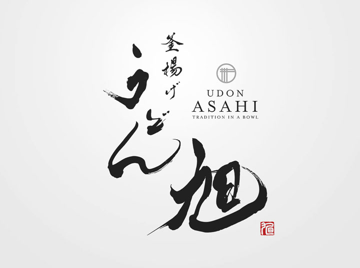
The strength and flowing lines of the characters express the supple texture and rich flavor of udon, conveying the charm of udon visually as well.
Logo Design Details
The elements of the logo include a simple yet striking design reminiscent of a Japanese family crest, which evokes a sense of contemporary cleanliness and sophistication within the tradition.
Furthermore, the red seal stamp functions as an eye-catcher, acting as a compelling element.
Conclusion
The “Asahi” logo expresses the brand’s identity by preserving the tradition of brush strokes while adding the refinement of modern design.
We hope this logo will convey the spirit of Japan through udon and leave an indelible impression on our customers.

