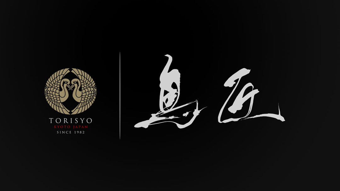
This is the logo design for “Torisyo,” a yakitori restaurant that exudes the history of Kyoto.
Embracing the long-standing traditions while also infusing a new breath of life, I took up the brush.
Concept
The concept of the logo is set around the theme of “harmony between motion and stillness.”
Japanese calligraphy often appears to be moving, but a deeper look reveals a sense of stillness and latent strength.
The intention is for this logo to convey the calm atmosphere of the restaurant, like the gentle warmth of smoke rising from yakitori, blending subtly with the surrounding environment.
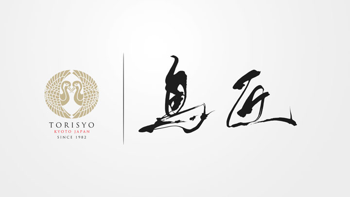
About the Calligraphy
The calligraphy possesses elements that evoke a quiet yet powerful vitality, symbolizing the delicate yet rich flavor of the cuisine “Torisyo” offers.
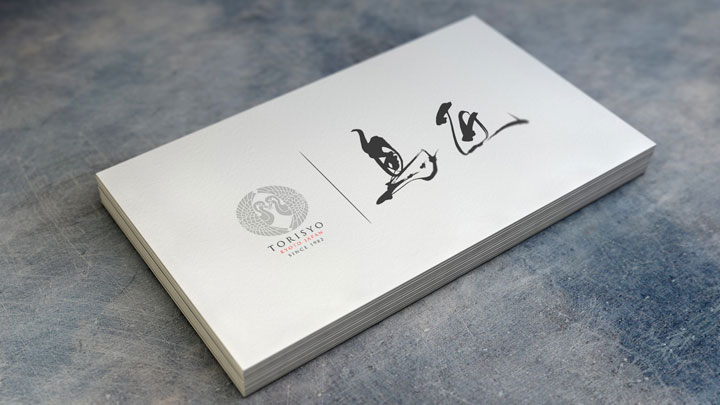
Logo Design Details
The emblem, fashioned in gold to resemble a bird, represents nobility and the weight of history, while the dynamic movement of the calligraphy signifies “Torisyo’s” commitment to continually seeking new tastes and experiences.
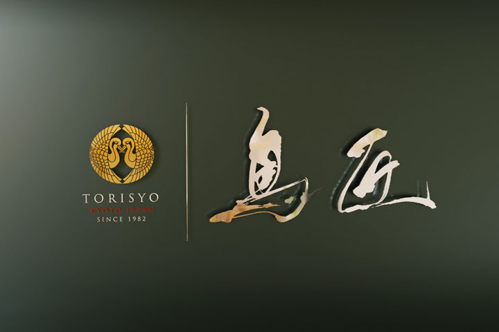
The balance between the emblem and the calligraphy is intended to harmonize the beauty of Japanese aesthetics with a modern design, where each element enhances the other in a cohesive composition.
Conclusion
This logo was created with the hope that it will make “Torisyo” more than just a yakitori restaurant, but a special place for everyone who visits.
“Torisyo” maintains traditions while stepping forward into new beginnings.
It is my hope that this attitude is also felt through the logo.

